76
Avant Garde
Ralph Ginzburg & Herb Lubalin, part II
Herbert (Herb) F. Lubalin (17 Mar 1918 – 24 May 1981) enrolled in Cooper Union at age 17 after scoring 64th out of an acceptable 64 on the entrance exam. As he later stated, “I had no talent at all and they almost threw me out of school because I was so bad the first couple of years.” Nevertheless he did graduate and after a number of design jobs ended up at Sudler & Hennessey where he showed his true talent for advertising and rose to the position of Creative Director and later partner.1
Around 1961 Ginzburg approached Lubalin, who was just about to go into private practice, to be the art director for Eros. It would turn out to be a match made in Heaven. As Ginzburg said “Lubalin and I worked together like Siamese twins.2 It was a rare and remarkable relationship. I had no experience or training as a graphic designer. Herb brought a graphic impact. I never tried to overrule him and almost never disagreed with him.”
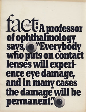
After the sudden demise of Eros, Ginzburg approached Lubalin to collaborate on his next magazine, Fact, which he intended to be a “hell-raising, muckraking magazine of dissent that would try to improve society by bringing to the fore data that was generally not known,” and “an antidote to the timidity and corruption of the American press.” It was the anti-Reader’s Digest, or as Steven Heller wrote “a magazine that had balls.”
In terms of art direction and production Fact was the polar opposite of Eros. On a tight budget Lubalin designed an elegant and minimalist B&W layout that relied almost entirely on typography:
Fact lasted for five years and reached a circulation of nearly 250,000 before Barry Goldwater successfully sued the magazine for libel.3
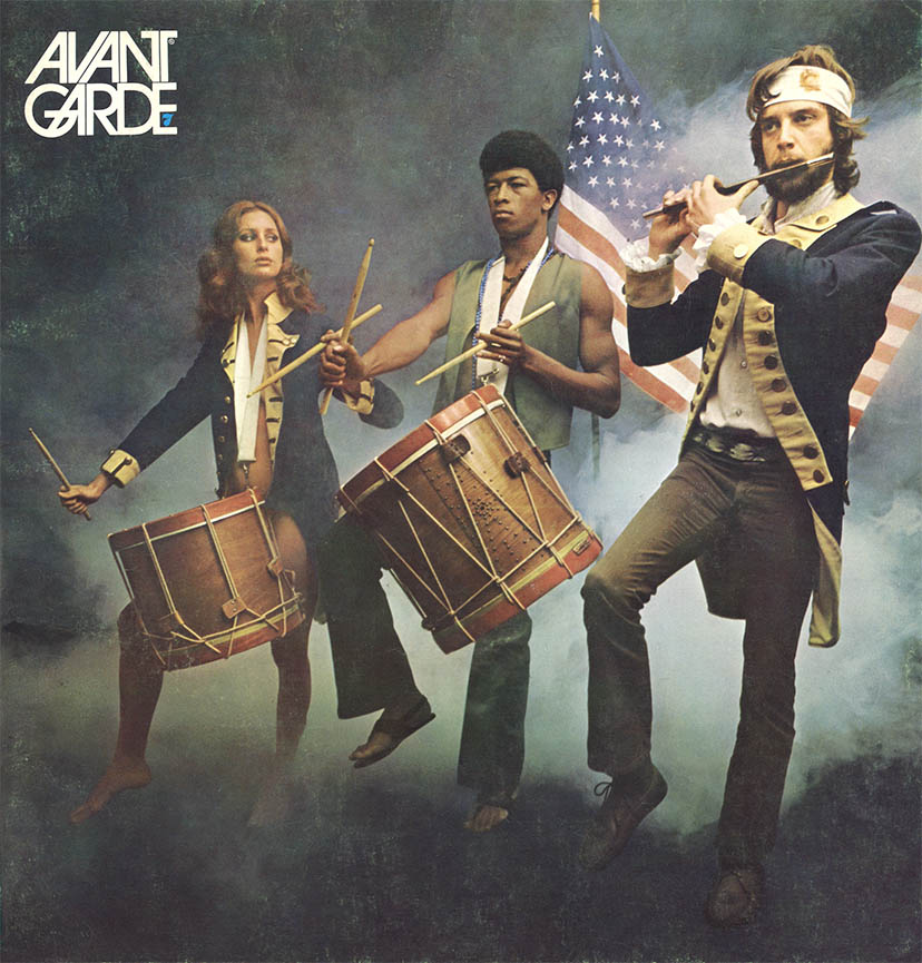
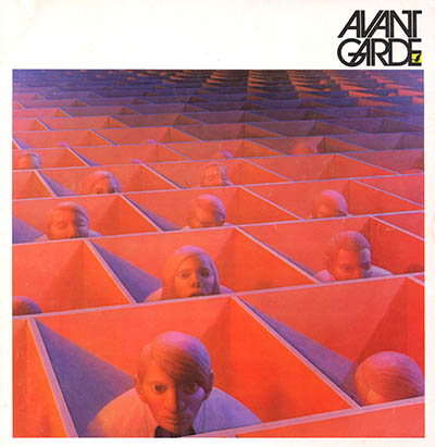
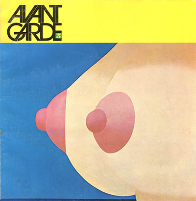
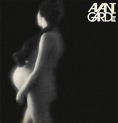
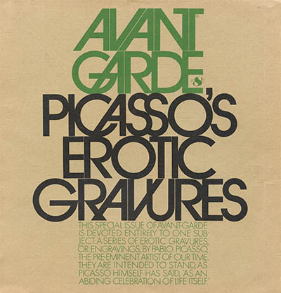
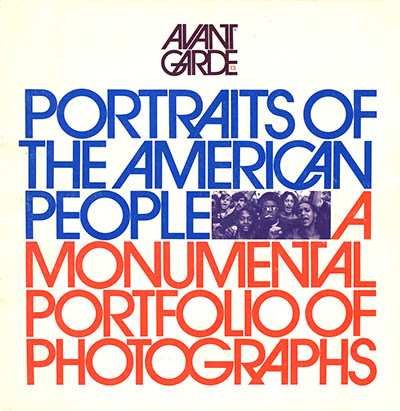
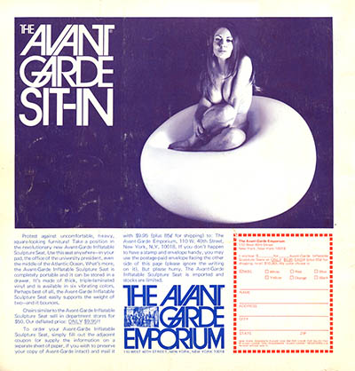
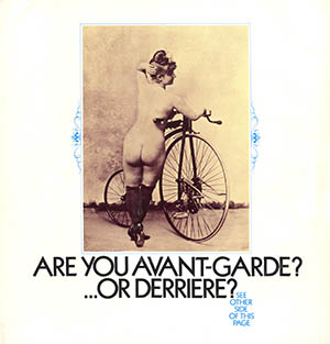
Six months after Fact closed shop Ginzburg and Lubalin collaborated on their third periodical – Avant Garde. The magazine, which Ginzburg intended for “a rarified, even elitist audience” was both editorially and artistically equal parts of the sexuality of Eros, and counter-culture politics of Fact. Perhaps no other magazine so successfully captured the zeitgeist of the late 1960s:
Landscape with Figures, George Tooker
Seascape #17, Tom Wesselman
In Full Bloom, Dewayne Darymple
Although the magazine was inventive and beautifully art-directed, it is perhaps best remembered for Lubalin’s rule-breaking logogram, which he and his partner Tom Carese would develop into a full-fledged commercial type family that became the most iconic, and most abused, typeface of the 1970s.4
Avant Garde lasted for 14 issues, folding in 1971 when Ginzburg finally had to serve his sentence for his Eros obscenity conviction.
In 1970 Ginzburg and Lubalin collaborated on one last magazine, Moneysworth, a counter-culture version of Consumer Reports and direct-mail masterpiece.5 The magazine not only survived Ginzburgs incarceration but was published until he retired in 1984.
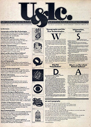
Lubalin went on to, among many other things, design and publish the typographically inventive and widely influential U&lc, a house organ for his own International Typeface Corporation:6
1. He became partner in 1952 and the company was renamed Sudler, Hennessey & Lubalin. Lubalin was a real-life Don Draper except he was much more soft spoken, taciturn and iconoclastic. Ginzburg sums it up nicely: “Herb spoke with his pencil.”
2. Today, of course, the politically-correct term is conjoined twins.
3. The Sept/Oct 1964 issue of Fact titled ‘The Unconscious of a Conservative: A Special Issue on the Mind of Barry Goldwater’ contained two articles about the Republican presidential nominee: ‘Goldwater: The Man and the Menace.’ and ‘1,189 Psychiatrists Say Goldwater Is Psychologically Unfit To Be President.’ Goldwater, Sen-AR and 1964 Republican presidential candidate, sued for libel and in May 1968, after a 15 day trial in the District Court for the Southern District of New York, the jury found Ginzburg guilty and awarded Goldwater USD 1 in compensatory damages and USD 75,000 (90 K after lawyers fees) in punitive damages. Ginzburg appealed the case to the Supreme Court, but in Ginzburg v. Goldwater, 396 U.S. 1049 (1970), the Court, by a margin of 6–2 upheld the lower Court’s ruling
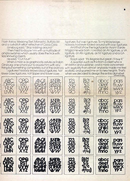
4. Lubalins initial difficulty with the logotype, then the design of the comercial typeface. and finally his disappointment with its’ application are now design legend. A Legend that your humble narrator has no intention in restating. For more details see: Heller, Steven. “Crimes Against Typography: the Case of Avant Garde.” in Looking Closer 5. New York: Allworth Communications, 2006, which can be found on Google books. Here is a specimen sheet from U&lc, vol. 1, issue 1:
5. Moneysworth is the magazine that the design press never mentions but it’s the one that would be by far Ginzburg’s most successful. It was relentlessly promoted in full-page ads. Ginzburg would spend as much as twice the subscription cost to gain a new reader. He made his money by selling the names to every direct-response marketer imaginable. 40 years later his advertising is still considered a masterclass in direct-mail marketing.
6. Just recently Fonts.com has digitized, at high-res, the back issues of U&Lc. Here is the current list.
22 Nov 2010 ‧ Design
