folio 176, recto
54
The Giant Bible of Mainz
Gothic Textura
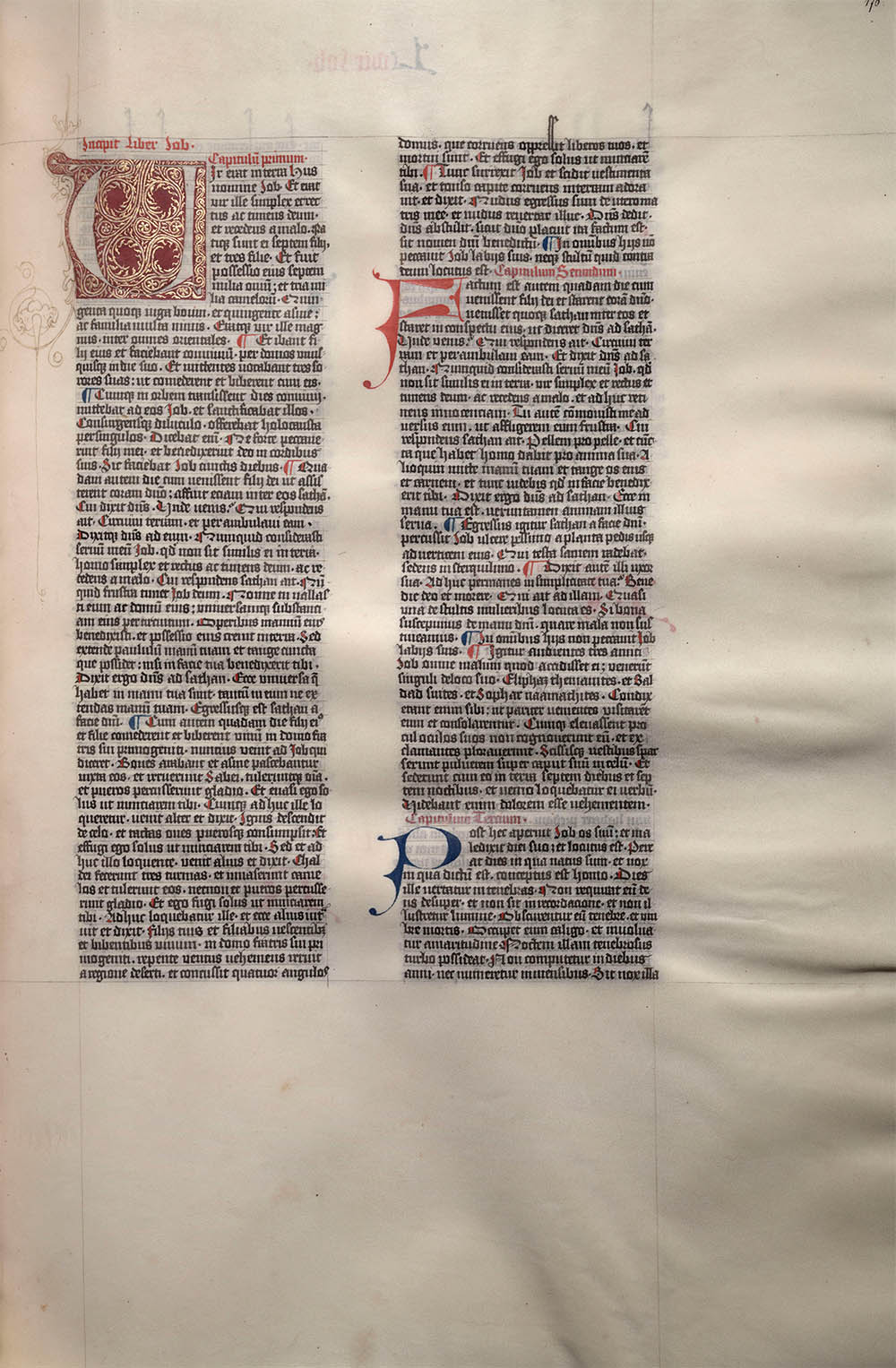
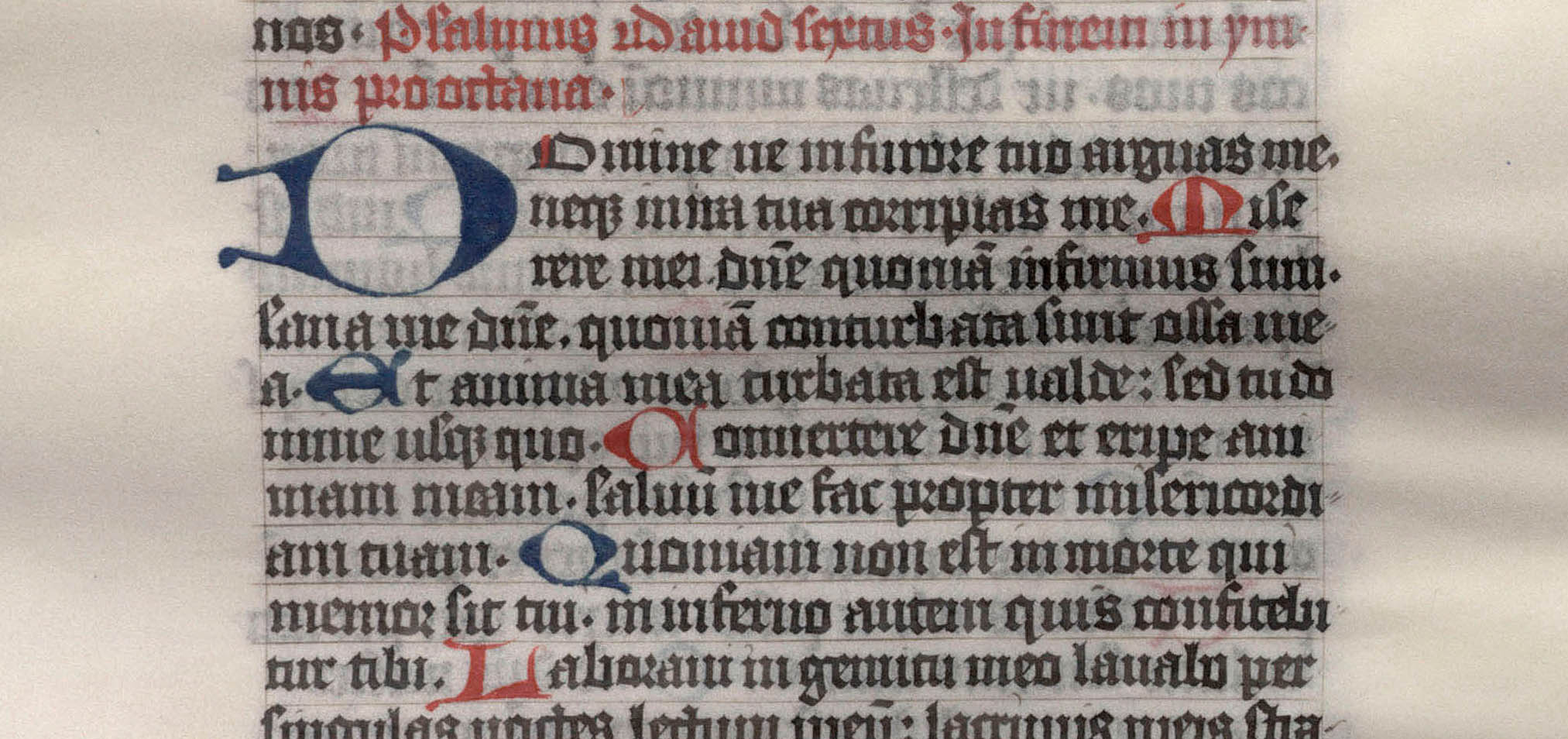
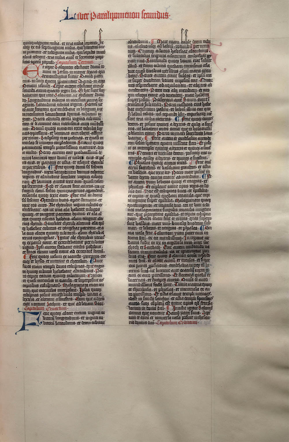
This exceptionally large vellum page, measuring 22 × 16", from the Biblia latina was likely produced in Mainz (or possibly Erfurt), Germany, hence it’s name – the Giant Bible of Mainz.
The Giant Bible was commissioned by a wealthy, but unknown, businessman for the Mainz Cathedral. According to the colophon, a single scribe (Calamus fidelis) wrote the text between 4 April 1452 and 9 July 1453. The text, two columns and 60 lines in a text-block of 18.75 × 12.75", was written in two shades of black with red and blue alternating paragraph and chapter openings. The illuminations, which were never completed, have been the subject of some analysis and debate.1 The historiated initials, borders and other illumination appear to be based on Rhenish model-books and were the work of several different artists.

folio 187, recto, and detail
Little is known about the location of the Bible until 1566. An inscription on the first leaf states that Heinrich von Stockheim, a curator at the Mainz Cathedral, deposited the book in the Cathedral library that year. The Bible was seized from the Cathedral by King Gustavus Adolphus II of Sweden after capturing the city in 1631 during the Thirty Years’ War. Gustavus presented the Bible to Bernhard, Duke of Saxe-Weimar, and it remained in the Duke’s family until 1951 when it was acquired by the famous collector Lessing J. Rosenwald. On 4 Apr 1952, the 500th anniversary of the Bible, Rosenwald donated it to the library of Congress.2 The Duke's descendants certainly took good care of the book; it's near-perfect condition suggests that not only was it never used as a lectionary bible, but it was rarely even opened.
The Giant Bible represents one of the last major scribal manuscripts. At the time of its completion, Johannes Gutenberg, perhaps just down the street, was in the middle of his work on his famous 42-line bible. Not surprisingly, the two books are quite similar. Although it appears unlikely that Gutenberg ever saw the Giant Bible, his illuminations probably followed the same model-books and may have even been done by some of the same artists.
folio 136, recto
By the 11th century Carolinian minuscule was replaced in Northern France and Belgium by angular, highly condensed, and much easier to write scripts. As the need for for books increased, by demand from the new literate class as well as the rise of the universities, scribes turned to these new scripts, collectively named gothic, and over the next few hundred years they spread throughout the continent. First to England and Northern Italy, then to Central France and finally to Germany.
These gothic scripts (AKA gothic minuscule, blackletter, old English, et. al.) included angular counters and serifs, forked stems on the b, h and l, and angled stems on the d. The scripts, written with the pen at a 45° angle, were much quicker to write than the carolinian minuscules and were much more condensed, saving valuable parchment. The result was an extremely elaborate formal hand that, unfortunately, became nearly impossible to read.
There are enough variants of gothic scripts to make the type taxonomer very happy indeed,3 but for our purposes they can be divided into three major categories: textualis (or textura), a formal book hand, Cursiva, a simplified cursive version of textualis, and bastarda (or rotunda), a hybrid of cursiva and textualis. Here are a few examples:
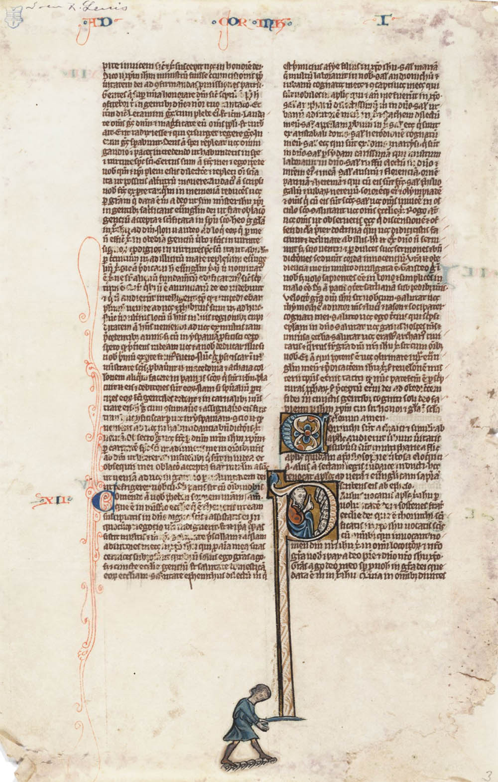
Textualis. Bible, Oxford, ca.1225
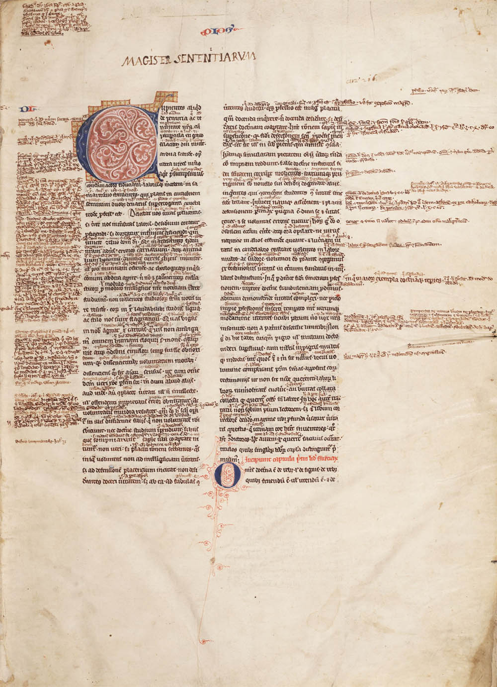
Textualis. Liber IV sententiarum, France, ca.1350

Bastarda. Book of Hours, Paris, ca.1480
Textura, named after the so-called woven texture of the written page, became, with regional differences, the dominant hand in Europe for several centuries. The Giant Bible, e.g., represents an extremely formal and quite accomplished version typical of mid-15th century Northern Germany.
The gothic scripts were mostly replaced by the humanist types of the Renaissance, with the notable exception of Germany. There the textura variants Schwabacher, and later Fraktur, became somehow ingrained in their national identity, and they were routinely used as late as the mid-20th century:4

Fraktur. Philosophie und Naturwissensdraft, Bonn, 1874
Even today gothic types are still a common display face, e.g. diplomas or newspaper mastheads.5 A surprisingly long life for a nearly illegible script.
1. A detailed analysis of the illustrations are in: Miner, Dorothy. The Giant Bible of Mainz: April Fourth, 1452–April Fourth, 1952. Washington: Library of Congress, 1952.
2. Library of Congress MS 8 olim Rosenwald 28. The Giant Bible is on display with the LOC's copy of the Gutenberg Bible in the Great Hall. For more information about these, as well as other significant bibles in the LOC's collection, see their online interactive exhibit. Note that the images here are adapted from the ridiculously large (>260 MB) images from the exhibition.
3. For example, see: G.I. Lieftinck, “Pour une nomenclature de l’écriture livresque de la période dite gothique. Essai s’appliquant spécialement aux manuscrits originaires des Pays-Bas médiévaux.” In: B. Bischoff, G.I. Lieftinck, G. Battelli. Nomenclature des écritures livresques du IXe au XVIe siècle. Premier colloque international de paléographie latine. Paris, 28–30 avril 1953. Paris: 1954. 15–34.
4. After promoting Fraktur during the 1930s as Die schöne Deutsche Schrift (the beautiful German Script), the Nazis outlawed it in Martin Bormann’s infamous 3 Jan 1941 Schrifterlass, stating “It is false to regard or describe the so-called Gothic typeface as a German typeface. In reality the so-called Gothic typeface consists of Schwabacher-Jewish letters.” See: Bain, Peter, Shaw, Paul. Blackletter: Type and National Identity. New York: Princeton Architectural Press, 1998.
5. For a review of modern gothic types see: Schalansky, Judith. Fraktur Mon Amour. Mainz: Hermann Schmidt, 2006, or New York: Princeton Architectural Press, 2008
23 Jan 2010 ‧ Typographia Historia