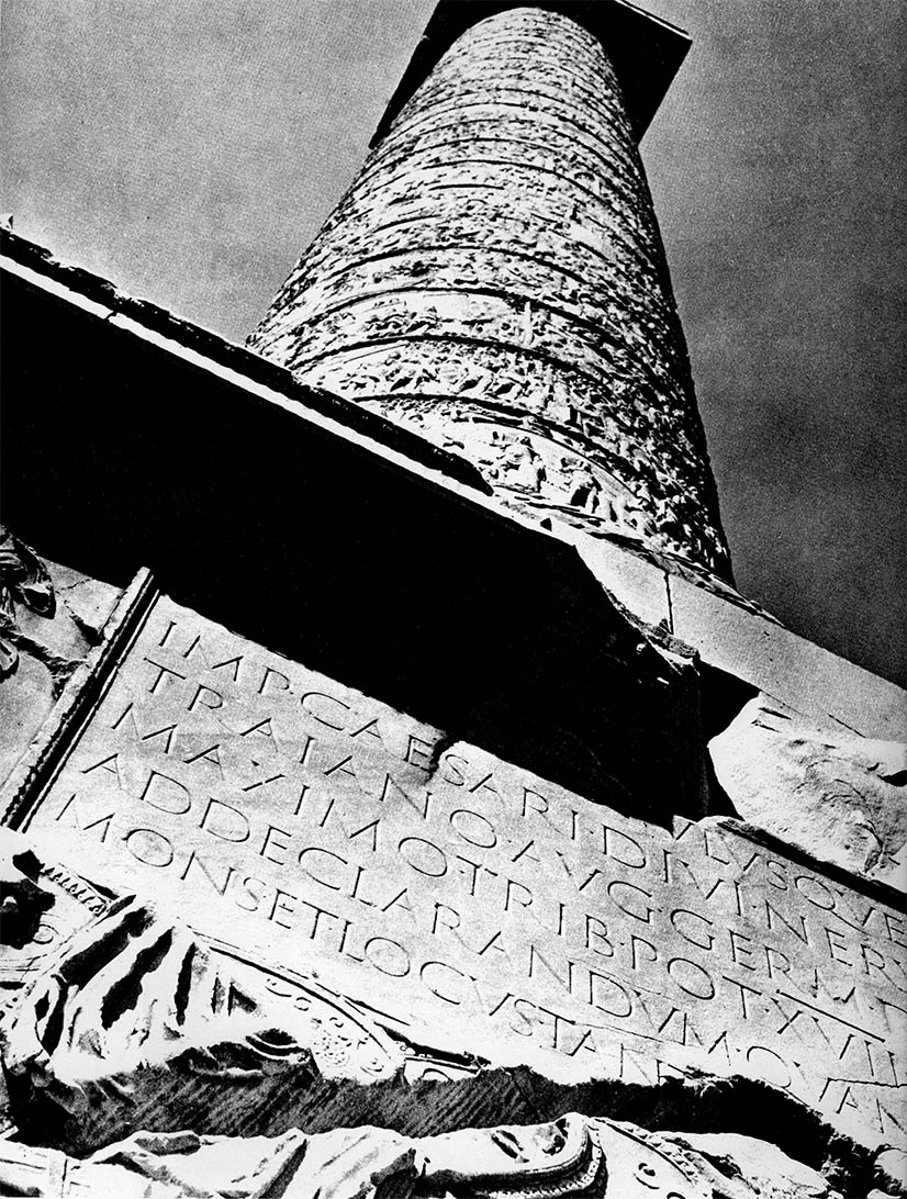
The inscription in situ, Oct 1963. Courtesy James Mosley
21
The Trajan Inscription
Capitalis Monumentalis
The Trajan column, located between the Greek and Latin libraries in front of the Basilica Ulpia in the Forum of Trajan, is a doric column with a spiral frieze, carved in low relief, depicting Emperor Trajan’s own account of his conquest of Decebalus and the annexation of Dacia (the campaigns of 101–102 and 105–106 AD). The monument, designed by the architect Apollodorus of Damascus, was erected between 106–113 AD and dedicated in May 113.
There is much to be said about the columns’ design1 and construction, or the frieze’s art, or the monument’s archeology and history, but, instead, lets just focus on the inscription on the base. The inscription (six lines and 37 words, many of which are abbreviated) is essentially a simple dedication of the monument. The letterforms, however, represent perhaps the most elegant, and certainly the most celebrated, example of the Roman letter. The inscription has served as the model Roman alphabet for almost two millennia.
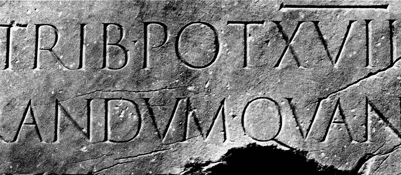
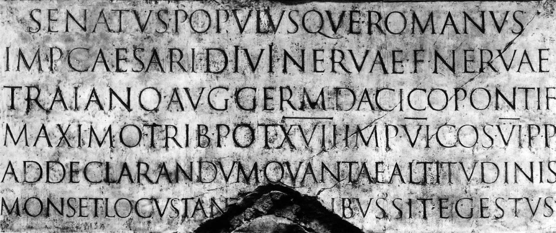
Detail from the column (top) and the entire inscription from a cast
Sometime around the first century BC Roman lapidary dramatically changed; from a flat and monoline inscription to a much more elegant geometrically based letter with terminal serifs. Exactly how or why this change occurred is the subject of at least some debate, but it most likely has to do with Roman calligraphy.
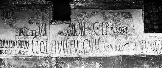
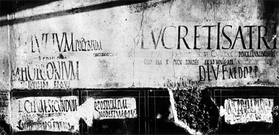
By this time the Roman scribes had developed a flat brush-written, condensed writing style that was particularly suitable for use on expensive parchment and vellum. Very little of this early calligraphy has survived with the notable exception of the Pompeiian ruins. Excavations of Pompeii, preserved under the volcanic ash of Mt. Vesuvius, revealed thousands of examples of written graffiti, such as these political notices:
The link between the Pompeiian writing and the Capitalis Monumentalis was first suggested in the early 1900s. W. R. Lethaby, in his introduction to Johnson’s classic 1906 writing manual stated that “The Roman characters... must have been settled by an instrument used rapidly; I suppose, indeed, that most of the great monumental inscriptions were designed in situ by a master writer, and only cut in by the mason, the cutting being merely a fixing, as it were, of the writing.”2 A half century later, Fr. Edward Catich, in his seminal studies of inscription, made the case that the letters were quickly drawn using a flat chisel-shaped brush (at about a 35° angle), creating the modulation of stroke widths as well as the serifs, then cut with a hammer and chisel into a V-shape, creating the illusion of form through shadow.3

Individual brushstrokes (left), shown combined (center), and compared to the inscription4
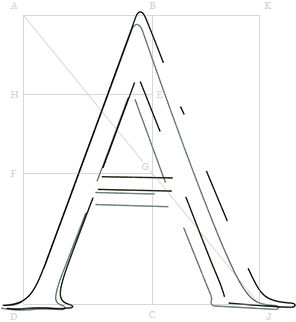
Catich extensively studied the individual letters and found that the vertical strokes were about twice as thick as the horizontal ones, and the height of the letters about nine times the width of the vertical strokes ― proportions that Catich considered nearly ideal. Perkins, further analyzing Catich’s drawings, found that the letters closely followed the classic geometries of the square, the golden rectangle and the similar root five rectangle:5
So, it’s pretty clear that the ancient romans had their geometry down, but the inscription is also highly calligraphic. Adjectives such as lively or kinesthetic have been used to describe it. According to Catich, the inscription is "the best roman letter designed in the Western world, and the one which most nearly approaches an alphabetic ideal," or, even stated even more emphatically by White: "No single designer, nor the aggregate influence of all the generations since, has been able to alter the form, add to the legibility, or improve the proportion of any single letter therein."6
After some 1300 years of scribal book hands, the Trajan inscription was “rediscovered” by the 15th century humanists. Beginning with Felice Feliciano, in his Alphabetum Romanum (1463), many scholars attempted geometric constructions of the Roman alphabet. These exercises were noted by the early type cutters, such as Griffo, and the influence of the Captialis Monumetalis is seen in serifed typefaces to this day.
1. Some specifics: the monument, a 98 foot tall doric column (125 ft including the pedestal), consists of 29 hollow 40-ton Luna marble drums. The continuous spiral frieze includes 155 separate scenes carved in a tipped-up perspective, and depicts more than 2500 individual figures, of which no less than 60 are of Trajan himself. This was surmounted, at least initially, with a bronze eagle, then a gilded statue of Trajan that subsequently disappeared. In 1587 Pope Sixtus V crowned the column with a statue of St. Peter. The interior consists of a 185 step helical staircase carved from 19 separate marble blocks and has an unusual geometry of 14 stairs per turn. The inscription, directly above the door, was carved on a 49 × 109" marble blank. The letters vary in size with the largest (at the top) being about 4.5".
2. Johnston, Edward. Writing and Illuminating & Lettering. London: John Hogg, 1906.
3. Which works wonderfully for inscriptions carved on white marble and viewed in the Italian sun, but less well for, say, a gray panel hung in a museum.
4. Catich, Edward. The Origin of the Serif. Davenport, Iowa: The Catfish Press, 1968. See also: Letters Redrawn from the Trajan Inscription in Rome. Davenport, Iowa: The Catfish Press, 1961, and, if you can find it, The Trajan Inscription: An essay. Boston: Society of Printers, 1973.
5. Perkins, Tom. The Geometry of Roman Lettering. In Font: Sumner Stone, Calligraphy and Type Design in a Digital Age. Sussex: Edward Johnston Foundation. 2000.
6. I have absolutely no idea who White is, but you have to admit it is a great quote.
18 Mar 2009, updated 29 Dec 2011 ‧ Typographia Historia