58
A Constructed Roman Alphabet
David Lance Goines on Calligraphy
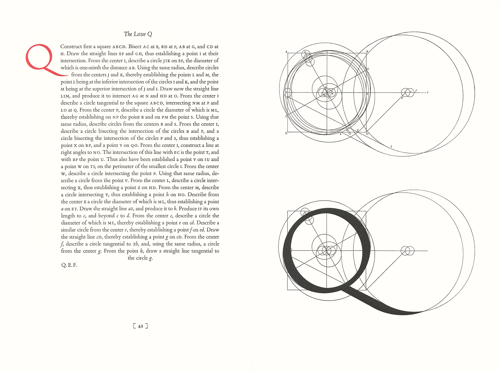
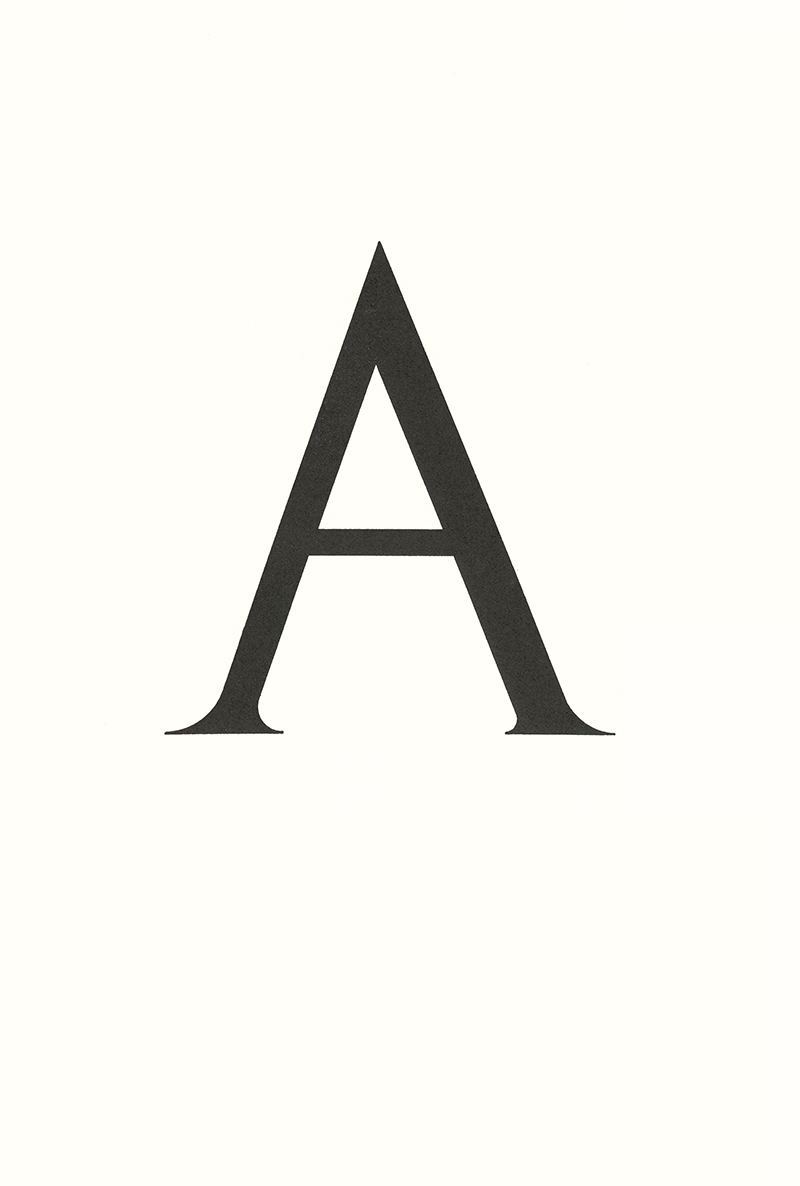
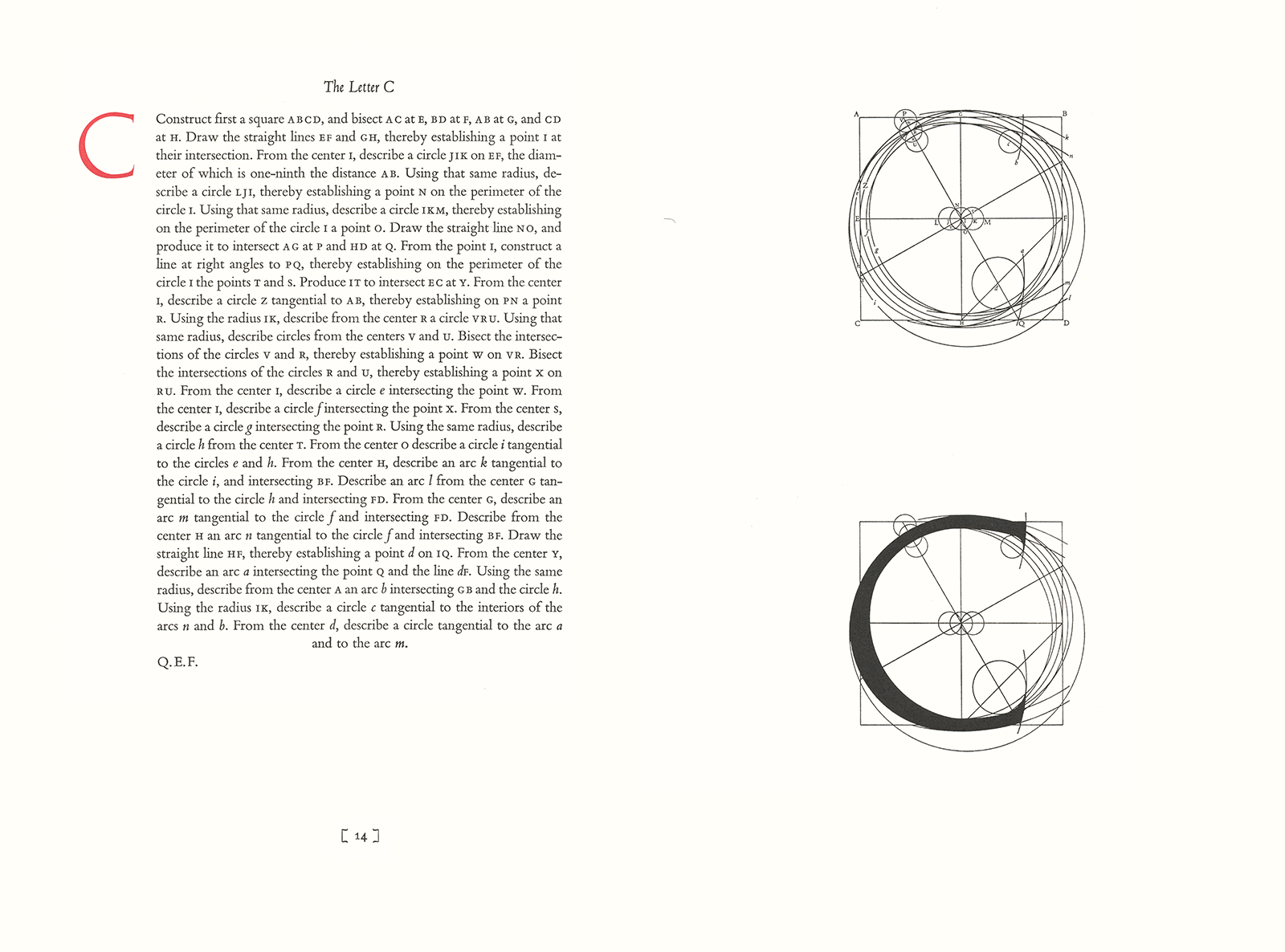
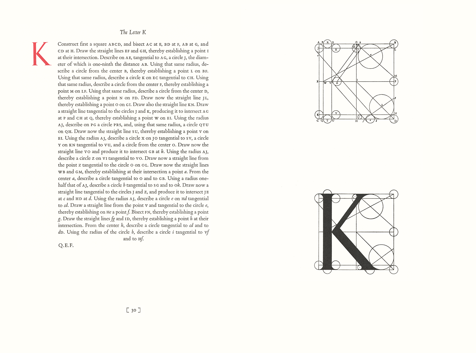
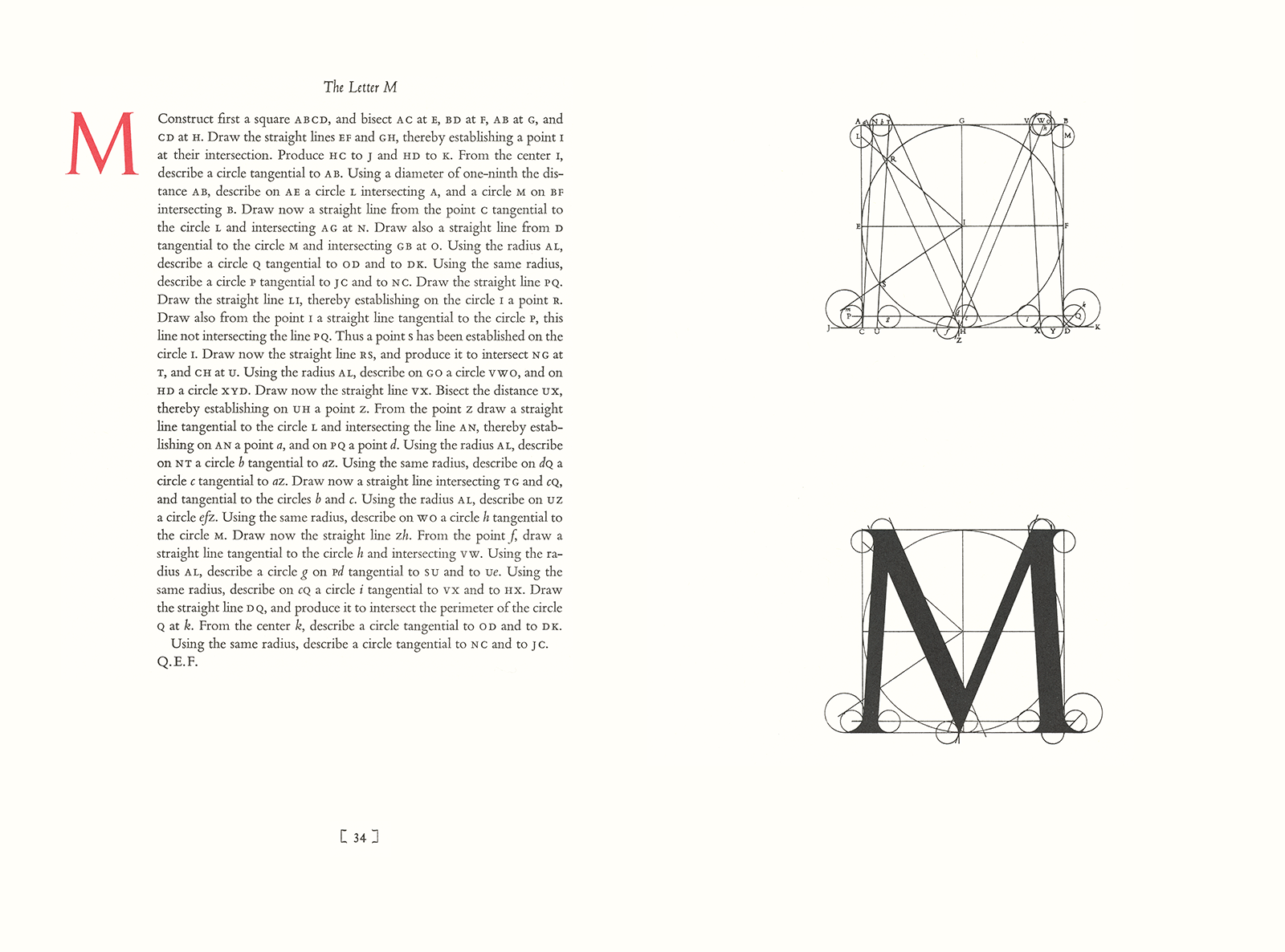
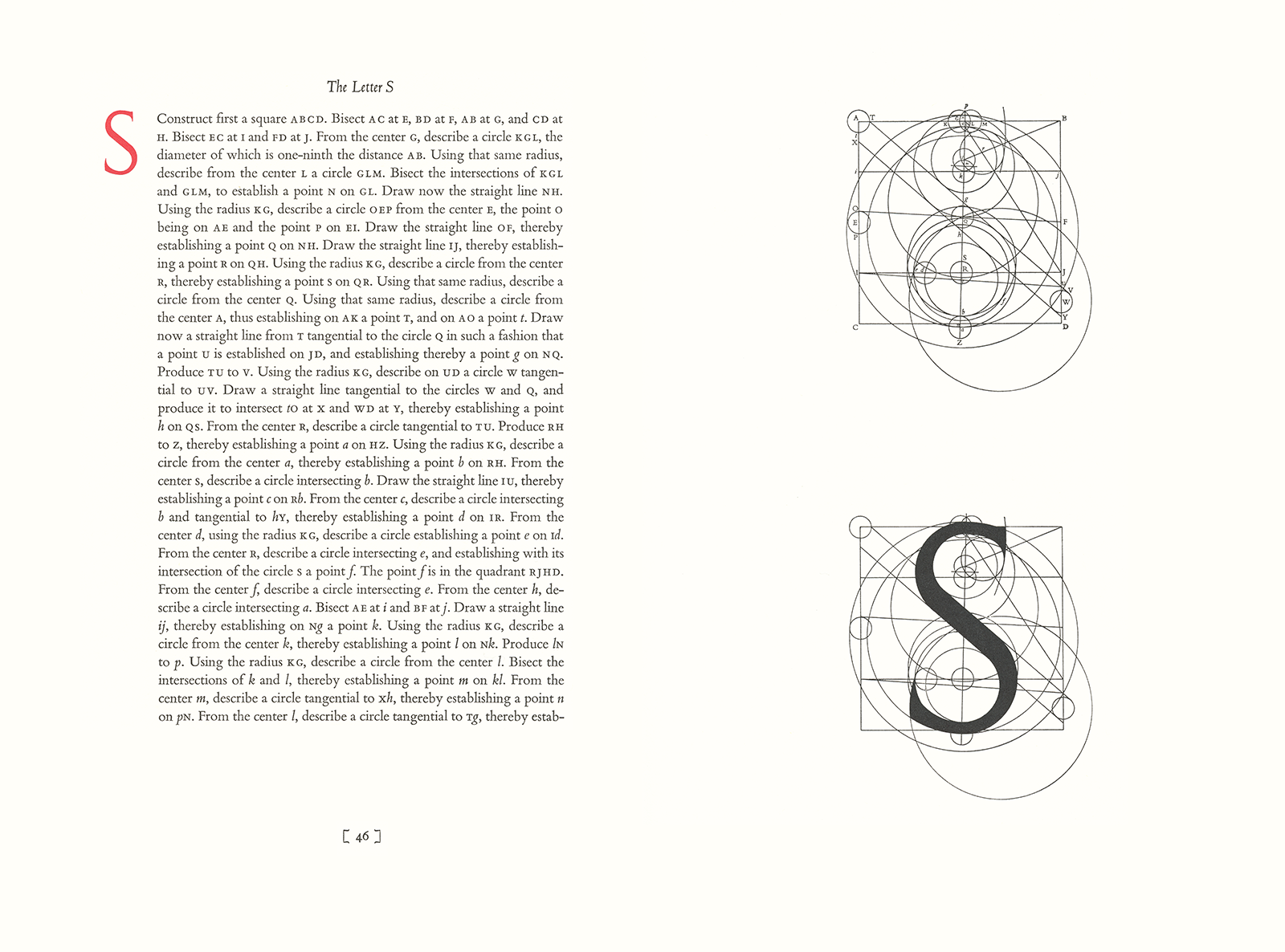
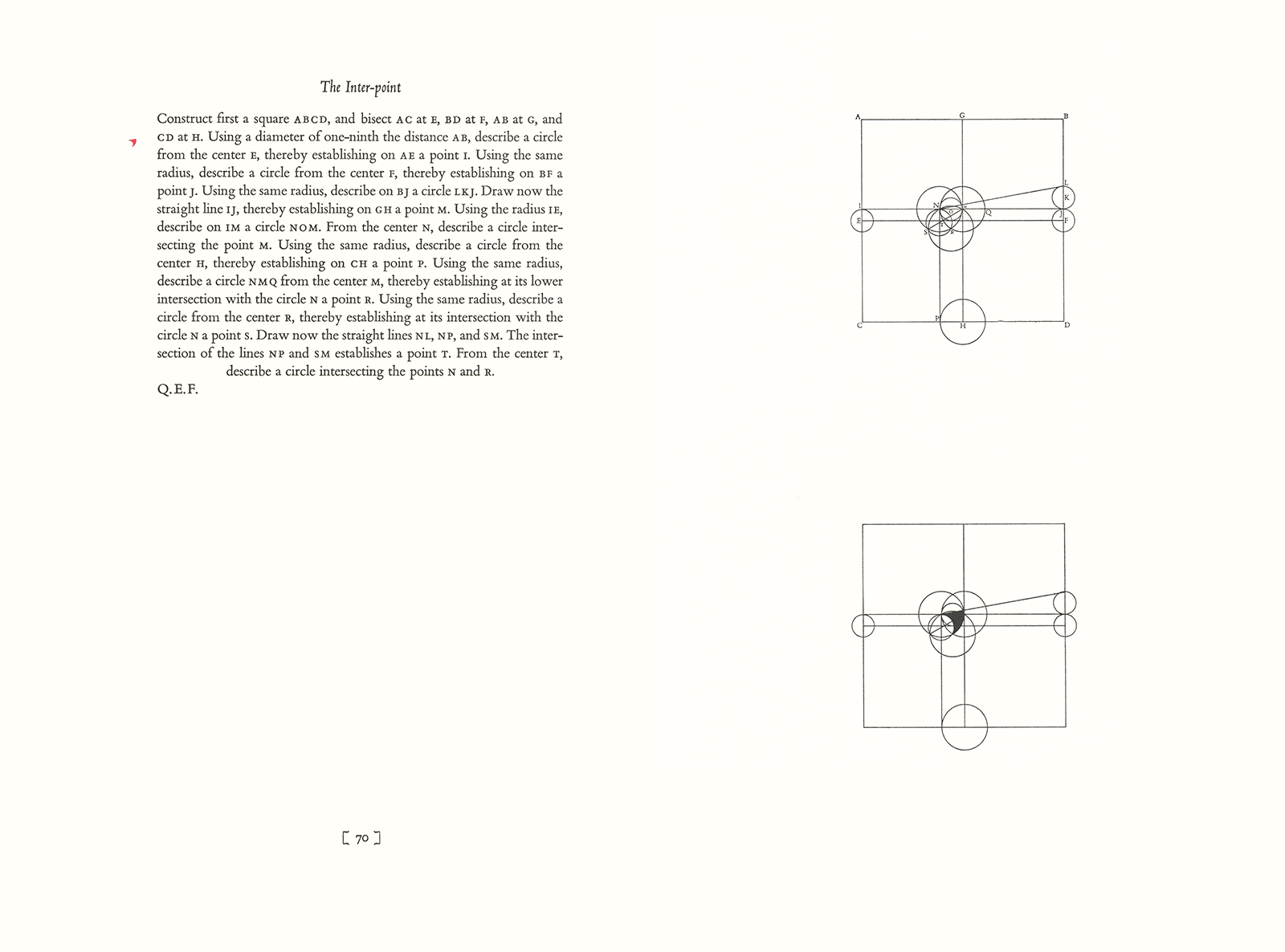
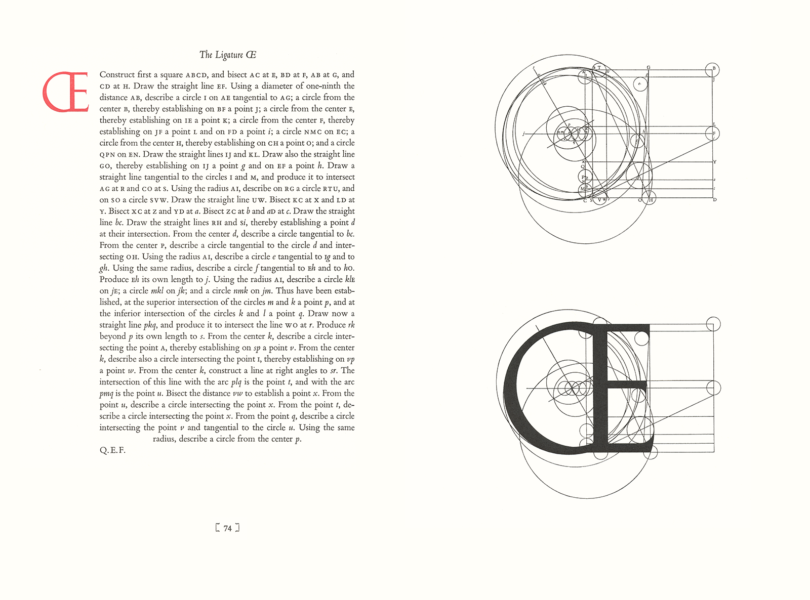
Here are the instructions to draw the letter Q, one of the more complicated examples from David Lance Goines’ A Constructed Roman Alphabet. Here is a detail from Goines 1979 poster showing the letter again:
Detail, No. 85, A Constructed Roman Alphabet
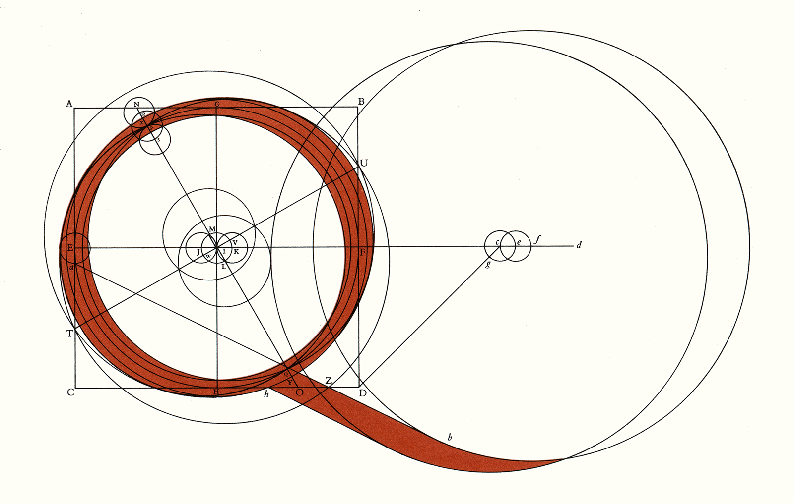
When you are finished with the exercise you should have something like this:

In addition to his poster work (here and here) Goines has published several books on calligraphy and typography. He credits his interest in the subject to his mother, herself an accomplished artist and calligrapher. As a teenager he recalled copying letters from the Speedball Textbook and the classic Three Masters of Italian Calligraphy.1 By the late 1960s he was teaching calligraphy to his friends and, later, through the University of California Extension.
To help with his teaching, Goines wrote and published two calligraphy manuals, both now classics, An Introduction to the Elements of Calligraphy and A Basic Formal Hand.
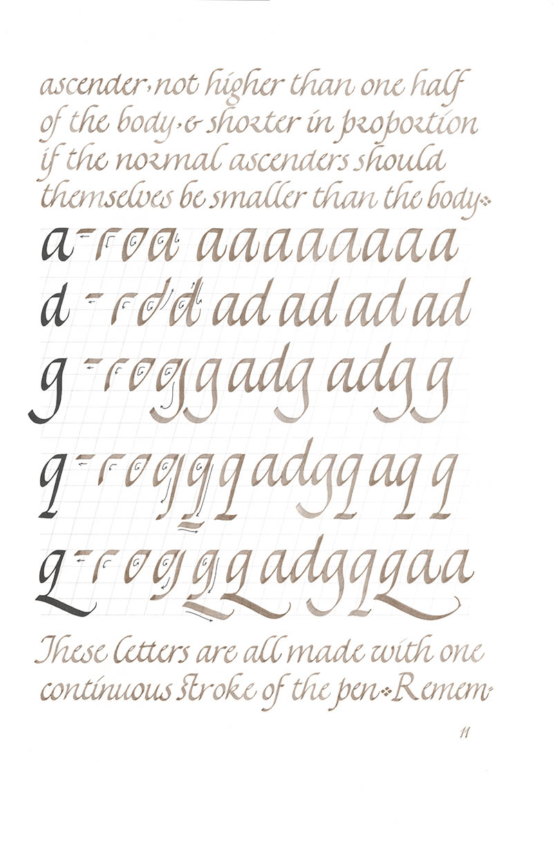
An Introduction to the Elements of Calligraphy,2 first published in 1968, presented instructions for writing a chancery cursive minuscule and a matching majuscule script. Putting his money where his mouth was, Goines wrote the 27-page text (albeit large, floppy, 4to-sized pages) entirely in the hand he was demonstrating:

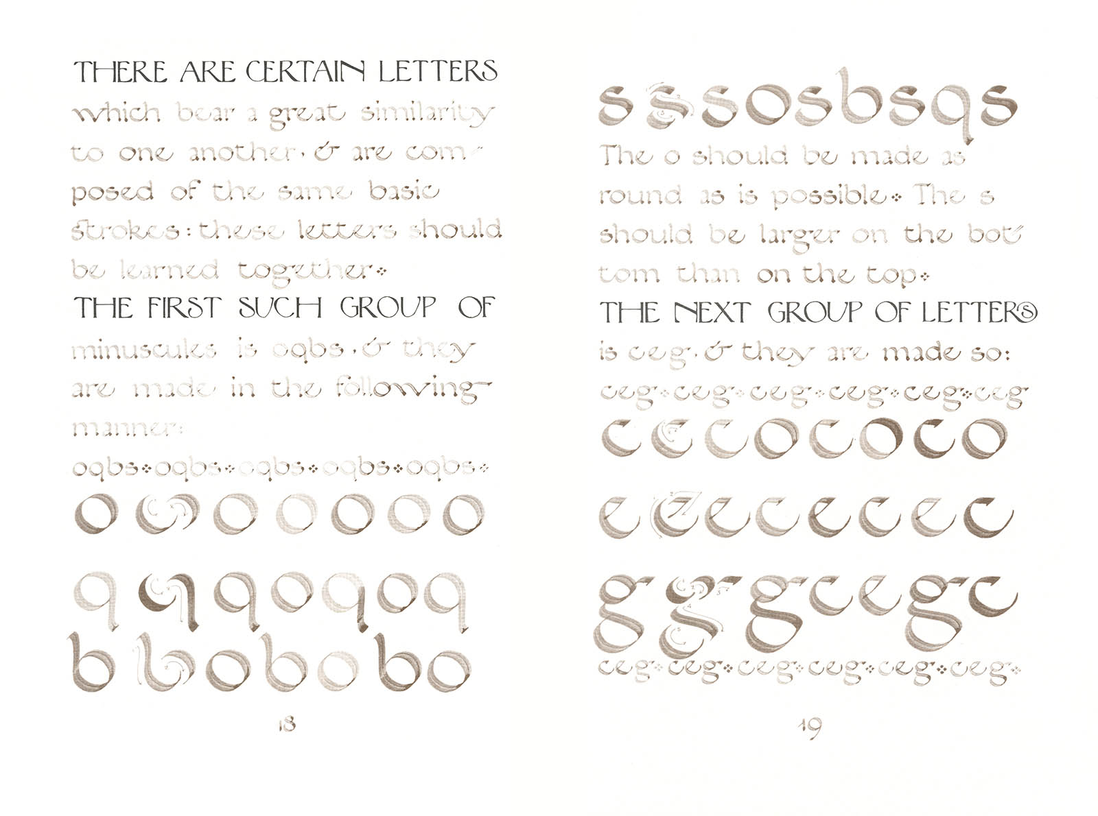
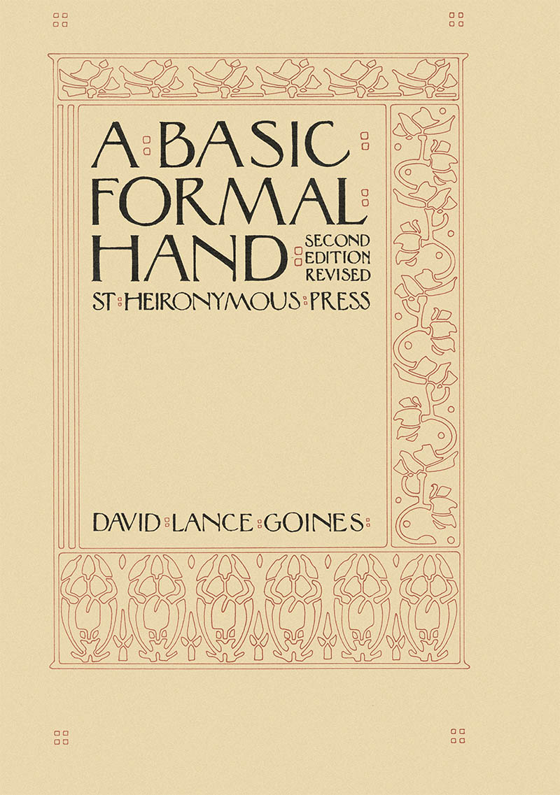
A Basic Formal Hand,3 from 1970, included instructions for a minuscule and matching majuscule based on the hands of the fifteenth century Italian humanists. Again Goines writes out the entire text:
The idea of geometrically rationalizing ancient Roman inscriptions became something of a pastime with Renaissance scholars. Felice Feliciano, Fra Luca de Pacioli, Geoffroy Tory, even Albrecht Dürer published treatises on the subject, and the idea has been pursued, with varying amounts of success, by artists and typographers ever since.
Goines interest in the subject began in 1967 after studying Dürer’s classic On the Just Shaping of Letters,4 and, as he later stated, “fun led to obsession.” He spent 1968–1969 in London, where he studied under the legendary Alfred Fairbank, and “devoted an unreasonable amount of time...to the pursuit of this bizarre subject.” He compiled this early work into a draft manuscript, A New Abecedarium, but was ultimately unsatisfied with his approach and the book was never published.
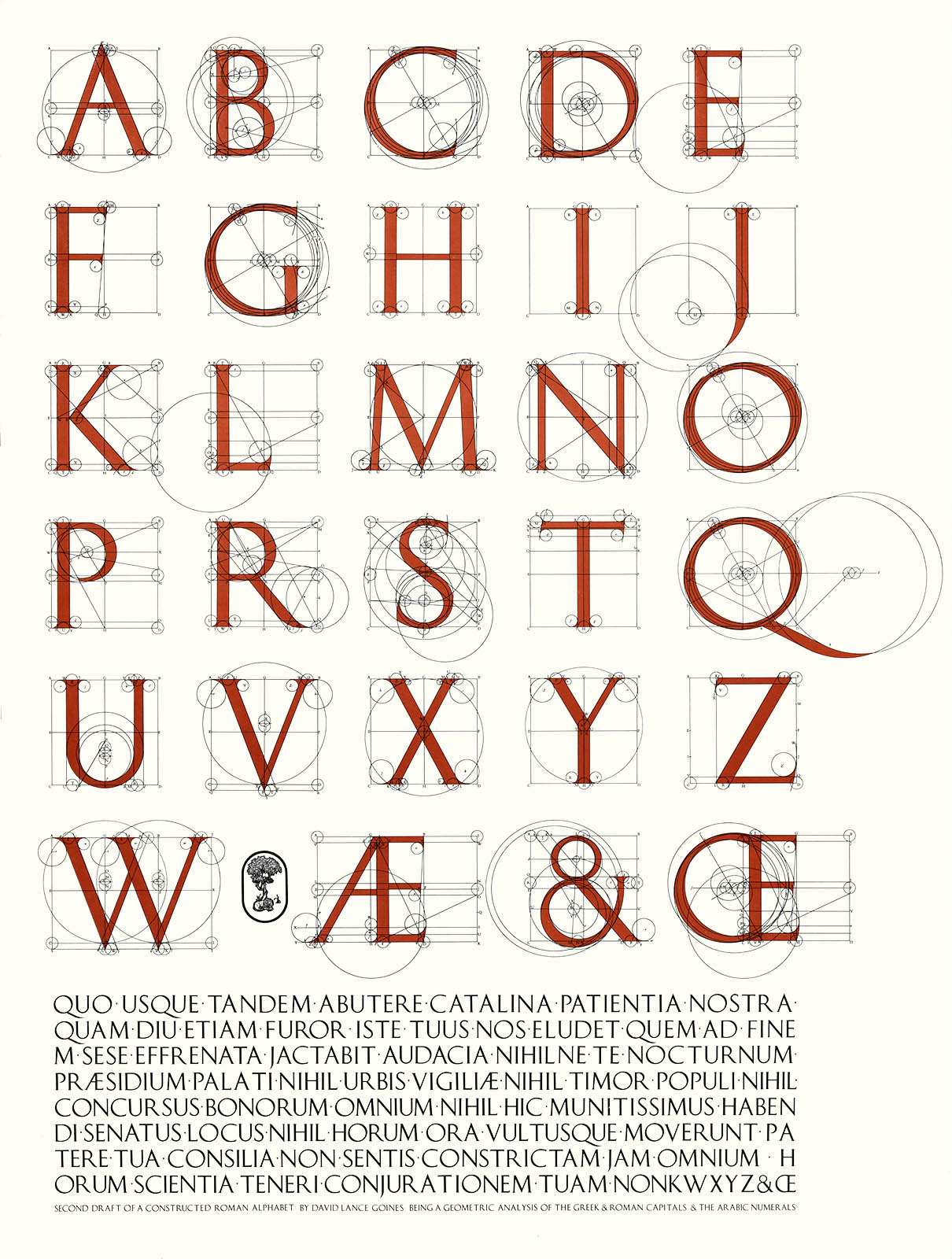

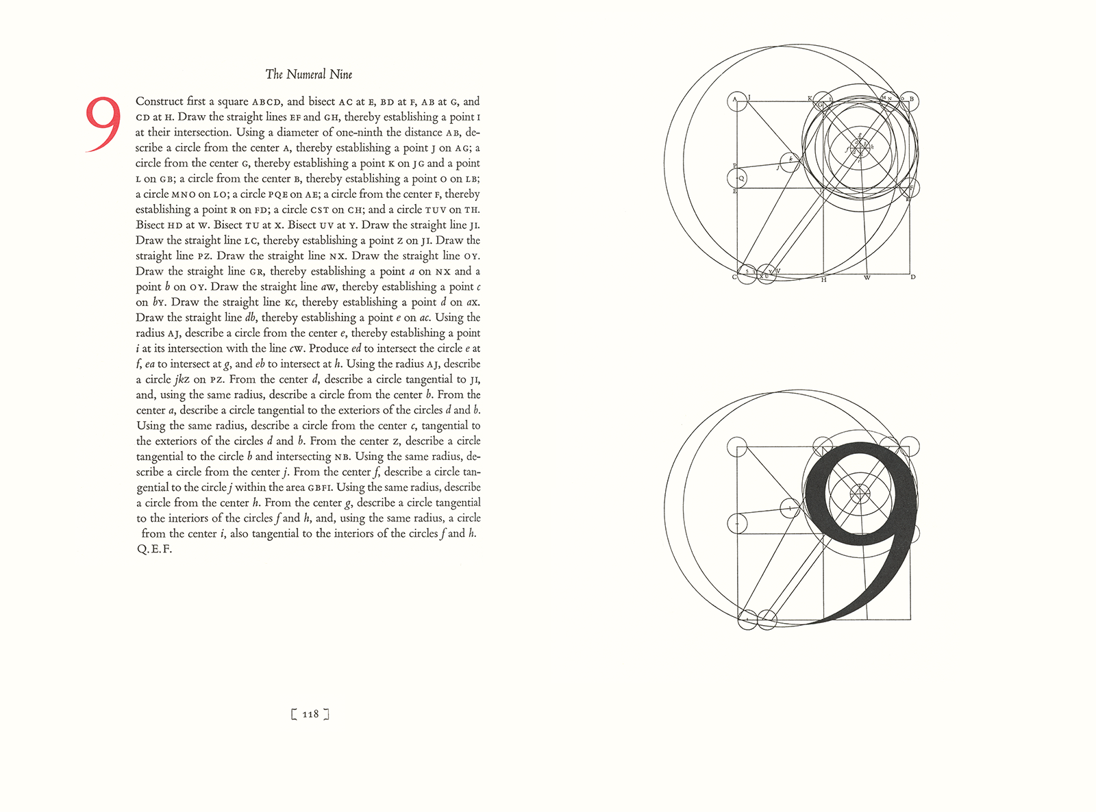
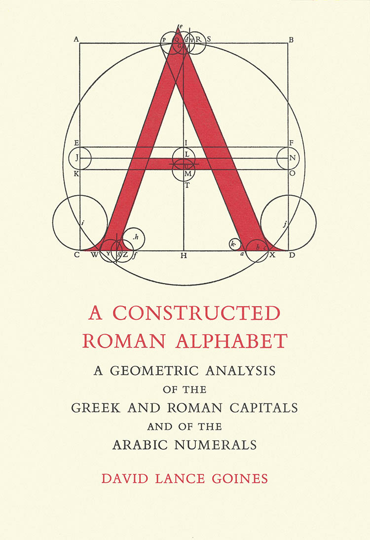
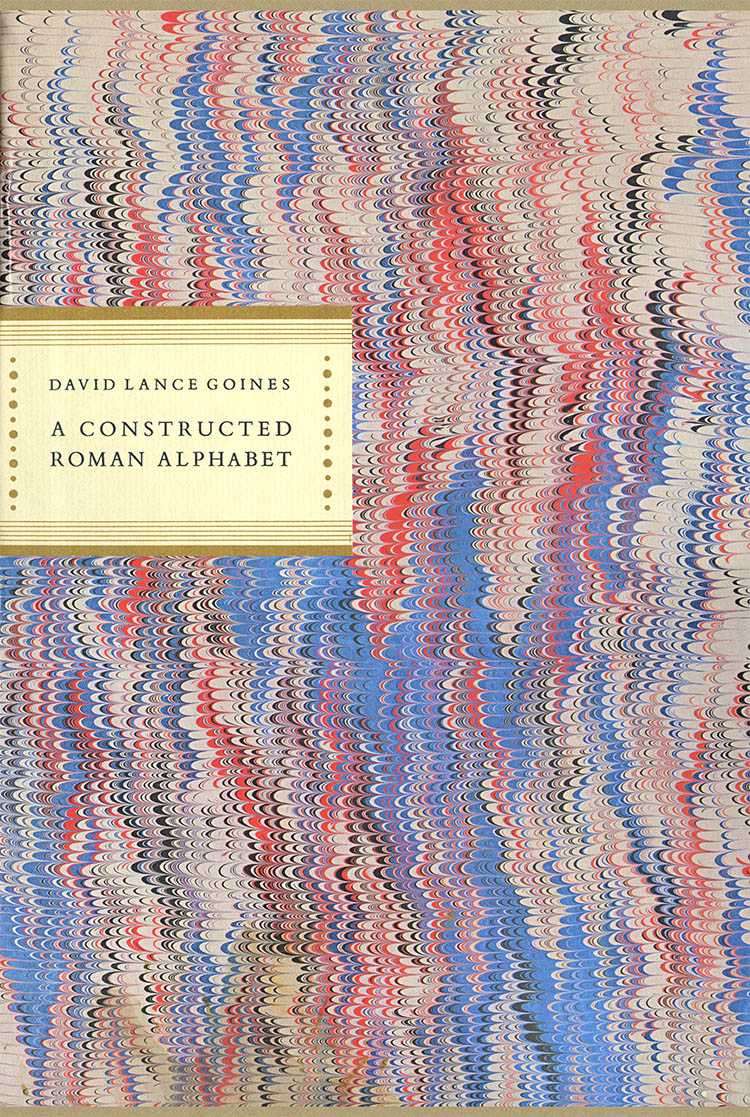
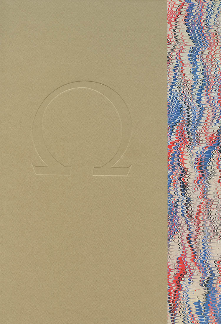
In the late 1970s, after David Godine promised he would find a publisher, Goines returned to the project. Using the Trajan inscription as a model (which we have already discussed), he created a complete Roman and Greek alphabet relying entirely on a compass and ruler. The result, published in 1982 by Godine himself was A Constructed Roman Alphabet.5
The scans here barely hint at how beautifully produced the book was, even by Godine’s usual high standards. The text was entirely letter-pressed, the diagrams were engraved on heavy paper, and the book was bound in hessian cloth. Of course, this no-expense-spared approach was, well, expensive – Godine’s list in 1982 was 50 USD (or, adjusted, nearly 115 USD today).
The book won, among other awards, the 1982 AIGA Book Show Award and the 1983 American Book Award (for typography), but as Goines pointed out “like many a critical success, its sales have proved disappointing.”

1. Ogg, Oscar (ed). Three classics of Italian calligraphy: An Unabridged Reissue of the Writing Books of Arrighi, Tagliente, and Palatino. New York: Dover, 1953.
2. Goines, David Lance. An Introduction to the Elements of Calligraphy. Berkeley: St. Hieronymus Press, 1968. This book went through three editions. Here is the printing history: First edition: 1000 copies. Revised and expanded second edition, first printing (1970): 2500 copies, second printing (1973): 1000 copies. Revised third edition, first printing (1975): 5000 copies, second printing (1978) 10000 copies.
3. Goines, David Lance. A Basic Formal Hand. Berkeley: St. Hieronymus Press, 1970. A second revised edition was published in 1972 and a third edition in 1976. The 2nd edition, which the above scans are from, was printed by photo-offset on wonderful Strathmore paper by Goines himself and is yet another beautiful example of his presswork.
4. Dürer, Albtecht. Of the Just Shaping of Letters. New York: Dover, 1965. This was a reprint of the 1919 Grolier Club book, which was a facsimile of part of Underweysung der Messung mit dem Zirckel und Richtscheyt (The Art of Measurement). Nüremberg: 1525.
5. Goines, David Lance. A Constructed Roman Alphabet: A Geometric Analysis of the Greek and Roman Capitals and of the Arabic Numerals. Boston; David Godine, 1982. Godine published the title as both a regular cloth-bound edition (Jan 1982) and a deluxe folio edition (Feb 1983).
The book, published as a single printing of 2000 copies, was 12×8", 178 pages with one foldout. It included instructions for drawing the Roman alphabet including several ligatures, the Greek alphabet and the Arabic numerals. The second, unpaginated, section included full page engravings of all of the letters, characters and numbers. The book was designed by William Luckey and set in Monotype Bembo and Monotype Narrow Bembo (AKA Fairbank Italic) by Michael and Winifred Bixler. The engravings were done by P & B Engraving company. The book was printed entirely in letterpress and bound in cloth by the now mythical Stinehour Press:
The deluxe version, limited to 225 signed and numbered copies, included the book (as above, but with a blue cloth cover) and a separate set of 51 unbound engravings in a slipcase, both boxed in a larger labelled slipcase. List on this edition was a rather prohibitive 150 USD.
The book is now long out of print but an electronic version is available on goines.net.
22 Feb 2010, updated 29 Jul 2012 ‧ Typographia Historia