
Detail, cover “E”
In Through the Out Door
Hipgnosis and the 1970s Album Cover
The Cambridge art school students Storm Thorgerson and Aubrey Powell began their London design studio Hipgnosis after being asked to do an album cover for their friends Syd Barrett and Rogers Waters and their fledging band. Their cover for Pink Floyd’s 1968 A Saucerful of Secrets attracted the attention of Ron Dunton who was in charge of graphics for EMI and they soon began designing covers for other EMI artists.
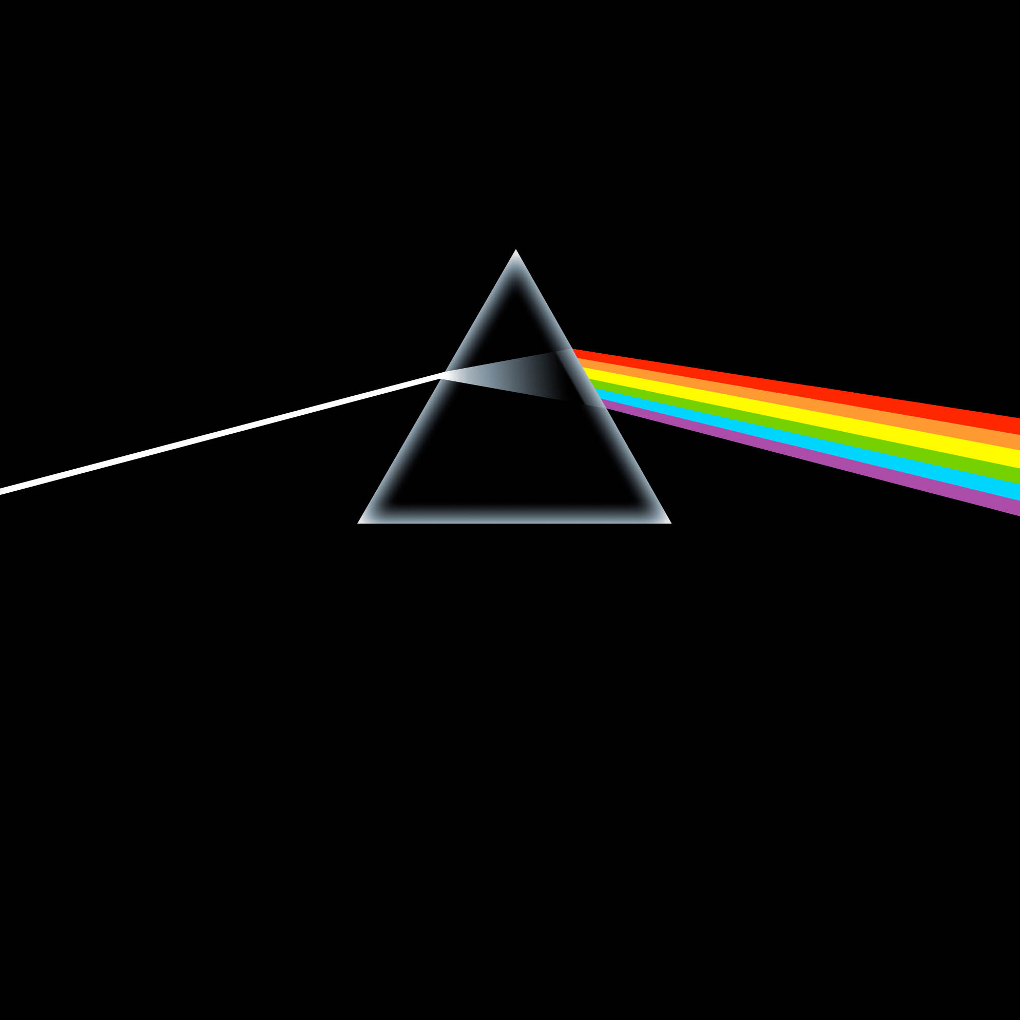
Thorgerson and Powell specialized in elaborate, highly-manipulated and often inscrutable tongue-in-cheek photographic-based designs for bands including The Nice, T. Rex, Electric Light Orchestra, the Climax Blues Band and Wishbone Ash. When designing Pink Floyd’s 1973 Dark Side of the Moon, however, the keyboardist Richard Wright asked Thorgerson “Could we not have one of your funny pictures?” and the result, after some consternation among Hipgnosis’ partners, was the now iconic triangle graphic:
The Dark Side of the Moon cover caught everyones attention and soon they were besieged by work from a who’s-who of British bands including what was then the biggest band in the world – Led Zeppelin.
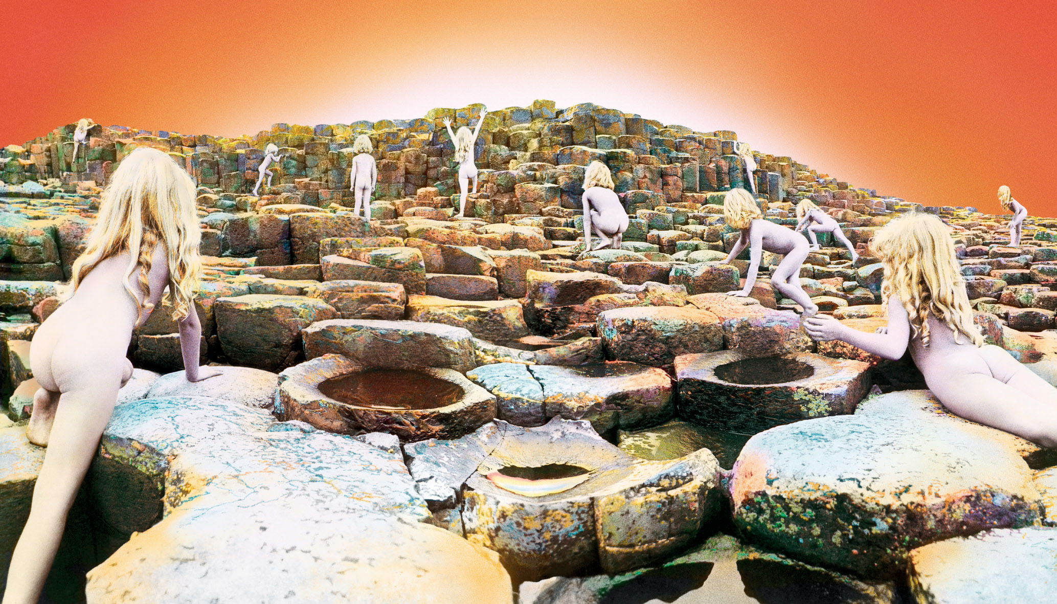
For Led Zeppelin’s 1973 Houses of the Holy Powell travelled to Northern Ireland and photographed the child models Stefan and Samantha Gates nude on the rocks of the Giant’s Causeway (something he noted that he couldn’t possibly do today). As he later recalled “It promptly rained for ten days straight... the only thing I could keep everybody together with was a bottle of Mandrax1 and a lot of whiskey.” The final highly composited and airbrushed cover was another iconic and inscrutable classic.
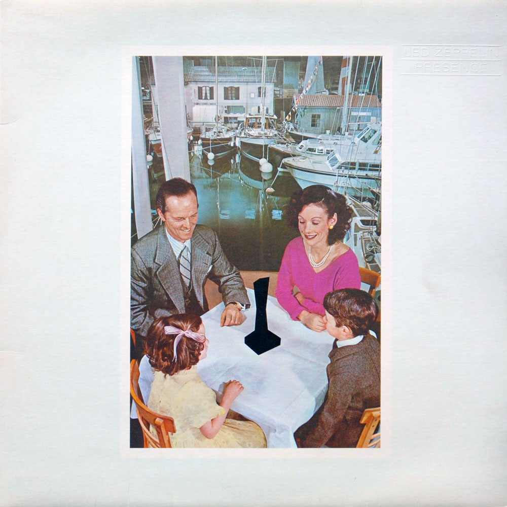
Hipgnosis’ next cover for Led Zeppelin was for their 1976 Presence. Designer George Hardie featured a mysterious oblisk – the “Object” – superimposed over banal, retro images of everyday life. The front and back covers were carefully staged by Powell and the interior gatefold images were from old Life and Look magazines. Your guess here is as good as mine.
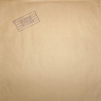
For their last studio album, the 1979 In Through the Out Door, Led Zeppelin’s design brief to Hipgnosis’ was simply “we don’t want anything too fucking weird” – an obvious reference to the Presence cover. What they got instead was one of the last of the great excessive album packages of the 1970s.
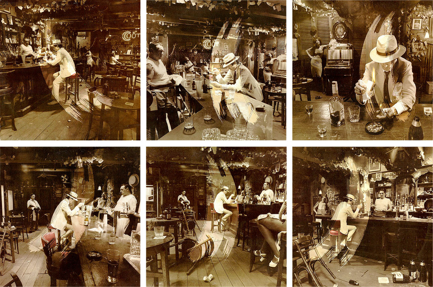
Powell came up with the idea of a man burning a “Dear John” letter at a bar and travelled to Martinique and New Orleans to scout the prototypical honky-tonk. Back in London he recreated the bar as a stage set and photographed the mise-in-scène six times – once from the perspective of each of the six characters. From this they produced six different album covers. Of course, you wouldn’t know which version you were buying because the record was packaged in an ink-stamped kraft-paper bag. It was a completely over-the-top promotional tour-de-force.
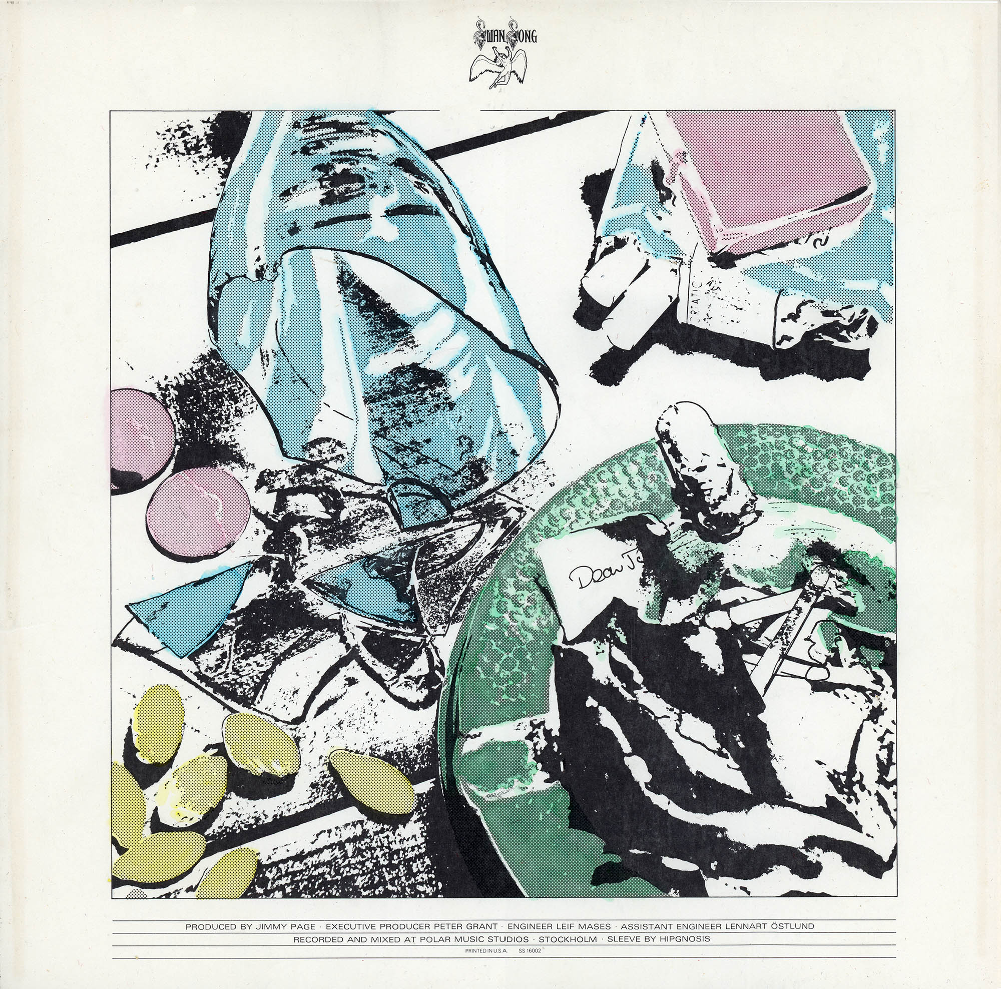
If the packaging wasn’t already expensive enough, Jimmy Page, based on one of his daughter Scarlet's coloring books, suggested the idea of a “magic dot” inner sleeve which would change color if you got it wet (and being 1979, many listeners likely learned of this special feature after spilling their bong water).2
In Through the Out Door marked not only the end of Led Zeppelin but of Hipgnosis as well. In 1976 the young designer Jamie Reid did the Sex Pistol’s Never Mind the Bollocks, “which cost about a tuppence,” and in 1979 – the same year as In Through the Out Door – 23-yo Peter Saville designed Joy Division’s Unknown Pleasures. Hipgnosis’ elaborate and expensive photo-based covers had been replaced by the DIY ethic of punk and new wave. Thorgerson and Powell finally closed shop in 1982.
1. Mandrax (Roussel Laboratories) was a UK trade name for the sedative-hypnotic drug methaqualone (CAS 77-44-68). It was better known in the US as Quaalude (Rorer or Lemmon), Sopor (Arnar-Stone) or for the very savvy drug addict, Optimil (Wallace) or Parest (Parke-Davis). By the early 1970s it had become the recreational drug of choice. It so highly abused that it was outlawed in both the UK and US (Class B and Schedule I, respectively). To bring this note full circle here’s Jimmy Page, ca.1977, in his Rorer 714 T-shirt:

2. By the early 1980s Atlantic discontinued the “magic dot” inner sleeve and printed only the “F” cover.
5 Oct 2015 ‧ Design