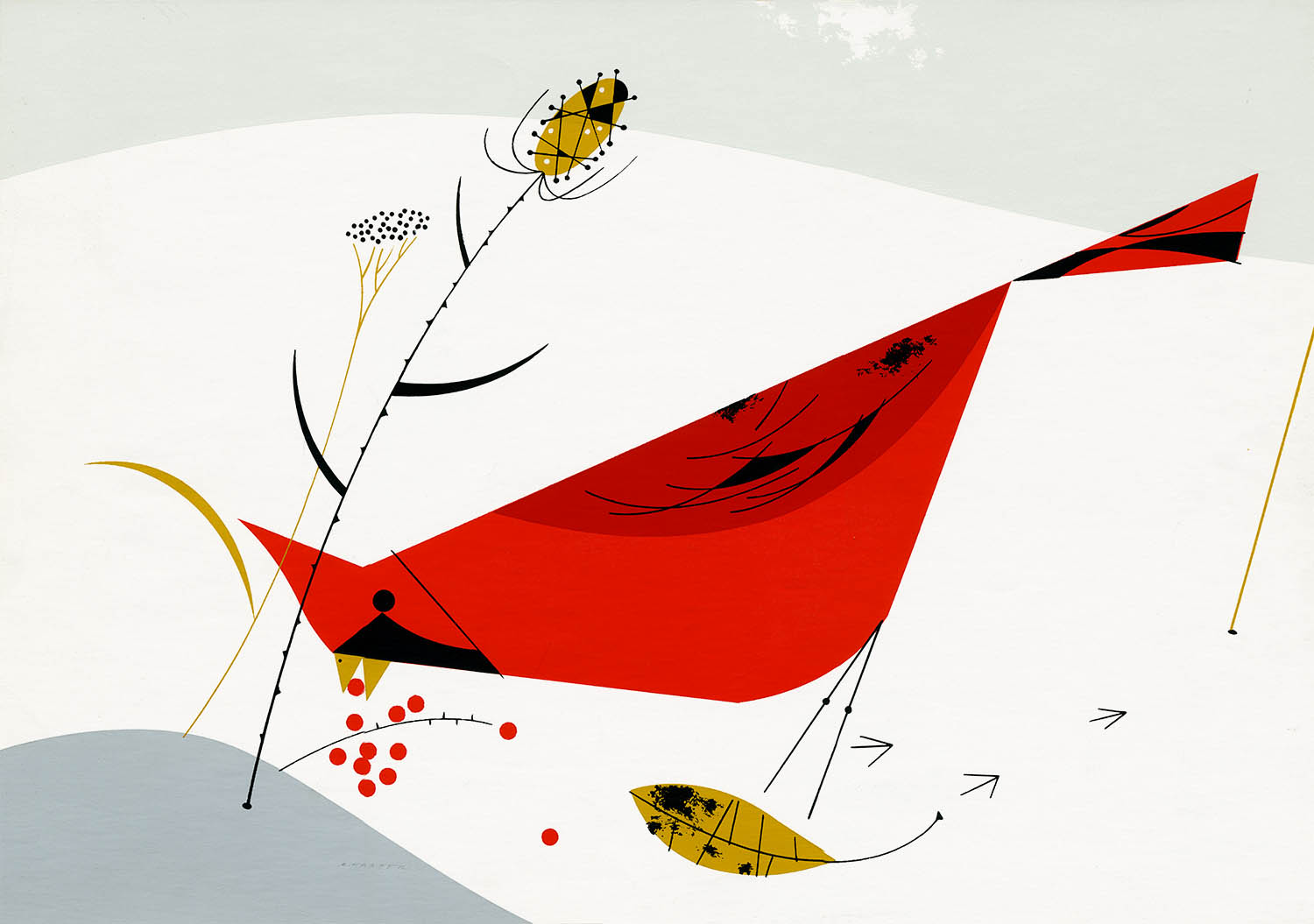
Cardinal, Cardinal with Berries or Cardinal Cuisine. 1954
The Birds
A Charley Harper Retrospective, part II
Charley’s friend, the artist Ray Podesta, was the first to suggest that his newly-developing style was particularly suitable for silkscreen and he taught the technique to Charley and Edie. As Charley later wrote: “I was immediately attracted to the process and found its limitations a further stimulus to the simplification of my designs.” 1 Indeed, it was the inherent requirements and limitations of silkscreening that, perhaps more than anything else, would define “minimal realism.”
Charley’s first work was a series of six silkscreens (or serigraphs, if you want to be fancy) based on children’s fables:

Humpty Dumpty, 1950
The response to Charley’s first Ford Times cover was apparently good enough for Arthur Lougee to suggest that Charley prepare a silkscreen for sale (5.00 USD) through the magazine:

Sole and Angelfish, 1951
This was followed by a series based on his illustrations for “Eight Familiar Fish” (Mar 1952) and a series depicting national landmarks for “Horseless Carriage Adventures” (Jul 1952–Jul 1953):
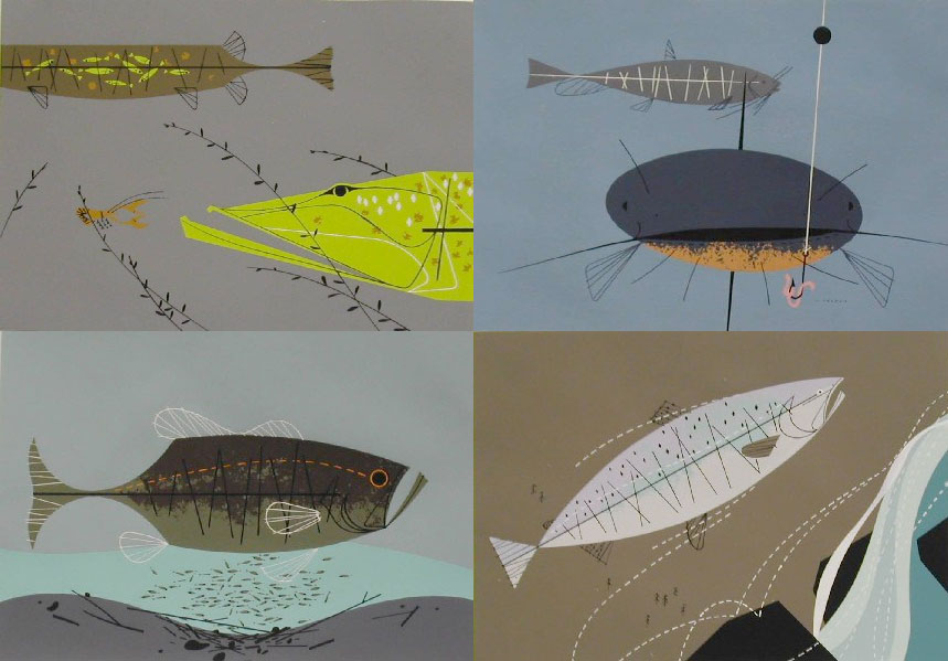
Four of “Eight Familiar Fish.” Clockwise from top left: Muskellunge, Catfish,
King Salmon, Large-Mouth Bass, 1952
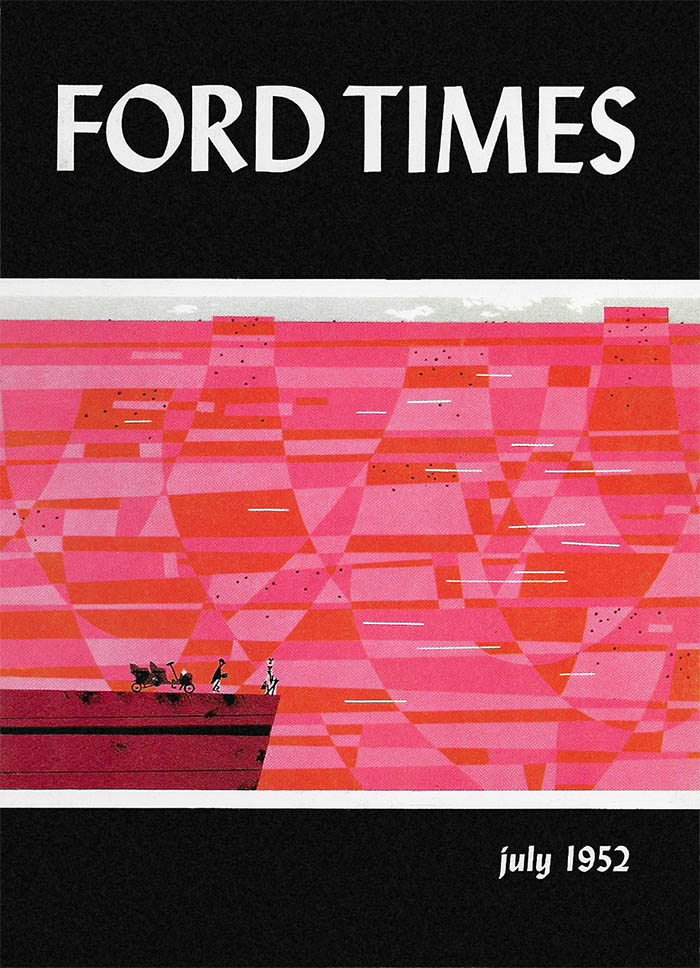
The Grand Canyon. “Horseless Carriage Adventures #1”, July 1952
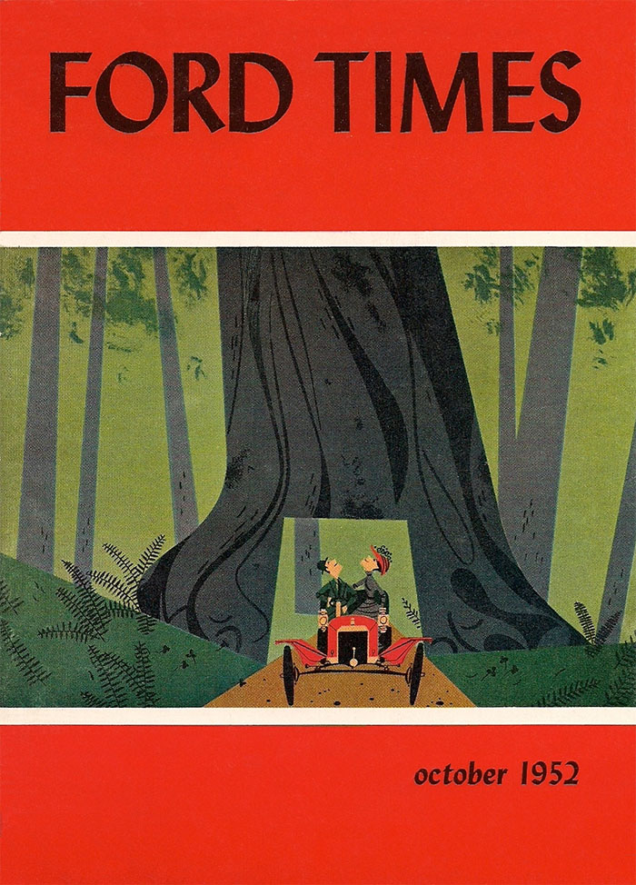
Wawona Tree, “Horseless Carriage Adventures #7”, Oct 1952
Then came the birds.
In 1954 Lougee commissioned Charley to illustrate an upcoming E. B. White article about feeding station birds. As Charley recalled: “I told him that I didn’t know what he was talking about – back on the farm, birds had seemed perfectly capable of feeding themselves.” Lougee sent Charley a sample feeding station to examine and, as he said in a 2006 interview:
“After I found out what a feeding station was, I got one and started drawing birds. But they wouldn’t sit still. I found a bird guide by Don Eckelberry3 and realized that was all I needed – those birds didn’t move. I’m the world’s worst bird watcher. That’s my dirty little secret. I do all my bird watching in bird guides.” 4
The result of all this was eight paintings for “Feeding Station Birds” in Nov 1954. As before, the article was accompanied by an offer for “hand-screened” prints. The rest, as they say, is history.
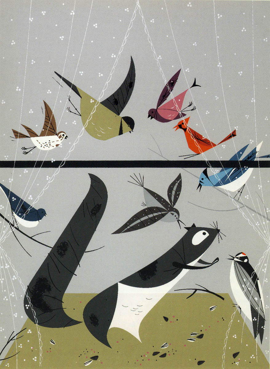
Feeding Station, 1954
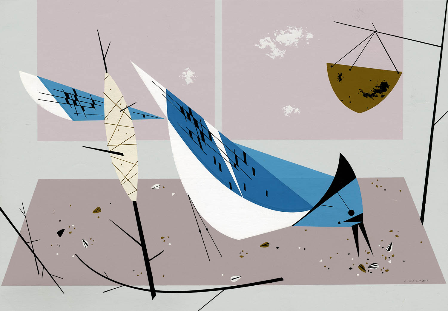
Blue Jay or Blue Jay Breakfast, 1954
In what would become something of an annual tradition, Charley would write, illustrate, and offer prints for a major bird article in the November issue.5
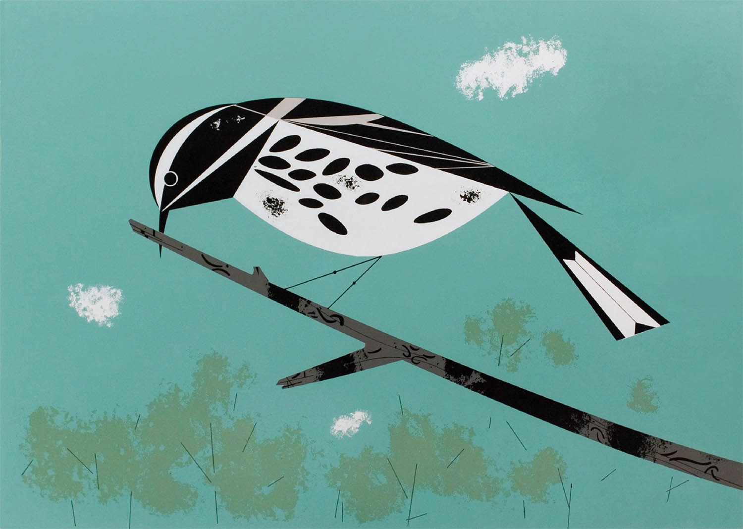
Black and White Warbler, 1955
Everglade Kite, 1957
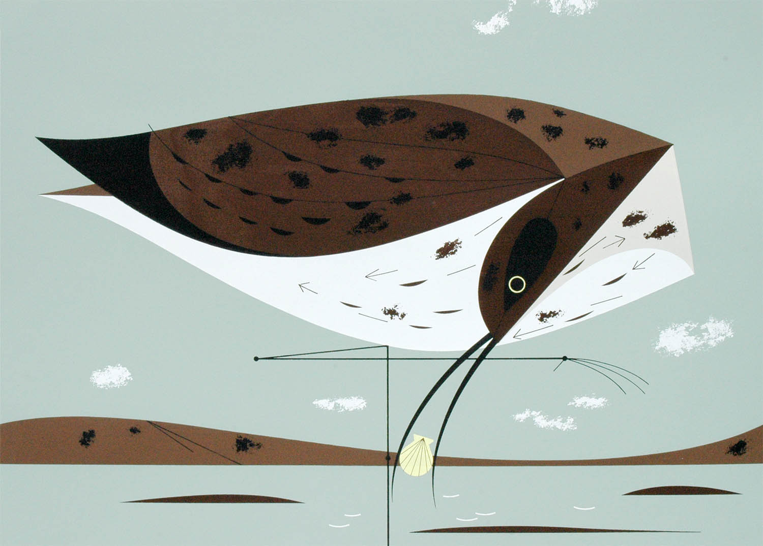
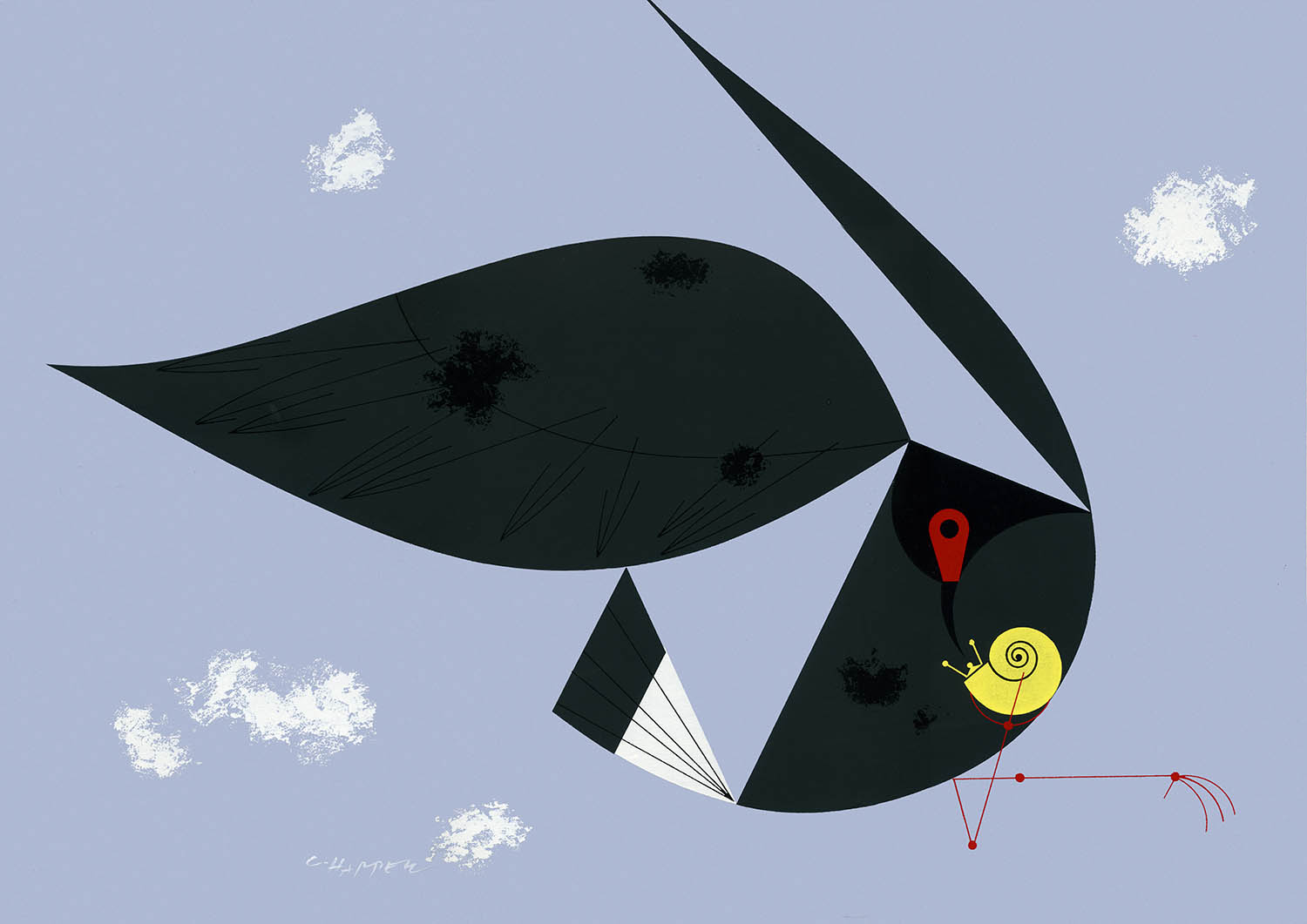
Eskimo Curlew, 1957

Passenger Pigeon, 1957

Snowy Egret, 1958
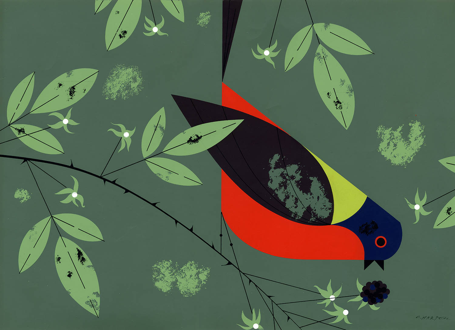
Painted Bunting, 1958
Charley’s original Ford Times illustrations were gouache on art board or, more commonly, paste-ups of gouache on paper cut to shape and glued to the background (we’ll call it mixed media). The silkscreens, ink on cheap paper, were entirely hand-produced by Charley (who cut the stencils) and Edie (who mixed the inks) in their Roselawn and later Finneytown studio.6
Attempts to reproduce the silkscreens in magazines, books, or on the internet simply don’t do the originals justice. For the first-time viewer the intensity of the actual prints come as something of a revelation.
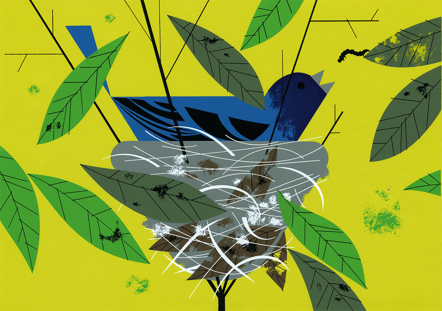
Indigo Bunting, 1959
In all, Charley produced 78 silkscreens for Ford Times between 1951–1960 and despite the magazine’s enviable circulation it appears that they didn’t sell particularly well. He would eventually return to the silkscreen, but not before illustrating some of the most beautiful science books of the 1960s.
1. Quoted from Charley’s letter to Wood Hannah. I told you I would crib heavily from this.
2. The original silkscreen prints were offered at 4.50–5.00 USD (or 42–50 USD adjusted for inflation). Today, depending on a combination of rarity, desirability, etc., these same prints go for 200–2500 USD. Charley didn’t keep any records, but it appears that he printed as few as several dozen (Niagara Falls) to as many as perhaps 500 (Green Jay or Mantis) of any given image. As he stated in 1997: “That was before anybody knew anything about signed and numbered editions or archival papers or anything like that.”
3. Eckelberry is best remembered for his nearly 1300 color illustrations for Richard H. Pough’s series of Audubon Bird Guides (1946–57).
4. Quoted from Tessaglia-Hymes, Diane. “Thinking the World of Birds.” BirdScope. 2006 Spring; 20(2) (online).
5. Here’s the entire list: “Feeding Station Birds,” Nov 1954; “A Farewell to Wings,” Nov 1955; “Ten Western Birds,” Nov 1956; “America’s Vanishing Birds,” Nov 1957; “Ten Southern Birds,” Nov 1958; “American Bird Architects,” Nov 1959 and “American Bird Census,” Nov 1960. E.B. White wrote the first two articles, but, beginning in 1956 Charley both wrote and illustrated the articles.
6. Around 1957 Charley and Edie bought a 5-acre plot in Finneytown and commissioned the young Cincinnati architect Rudy Hermes to design a house and studio. The flat-roofed “International style” house is set on a hill so a single story in front gives way to two story wall of glass rather dramatically overlooking the beech woods in the back. Todd Oldham has described it “like [being] at the top of the Poconos.” It’s also smack-dab in the middle of a residential subdivision.
For more about the house see: Kieffer, Nina. “A Bird in Hand: Charley Harper.” Housetrends. 2011 Mar; 10(1): 30–32 (online).
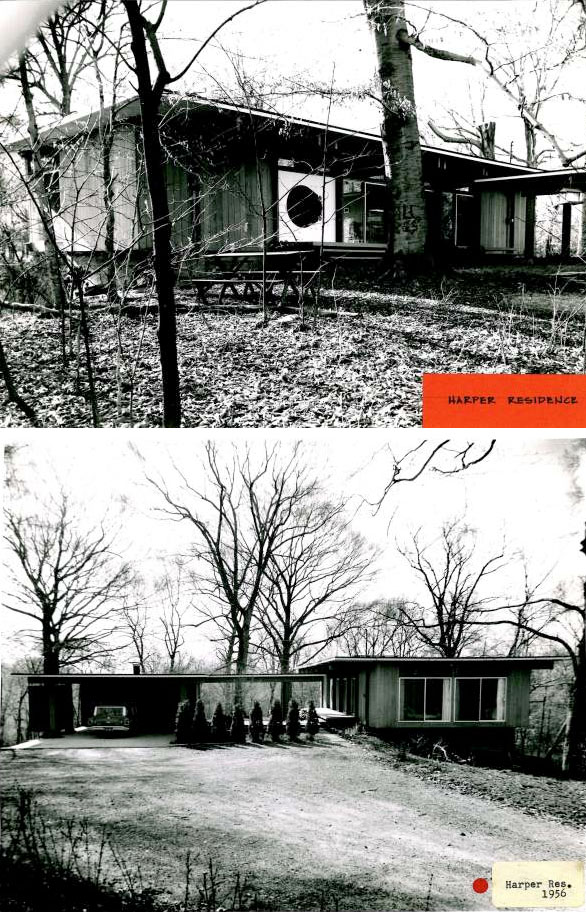
The Harper residence, ca.1957. Susan Rissover
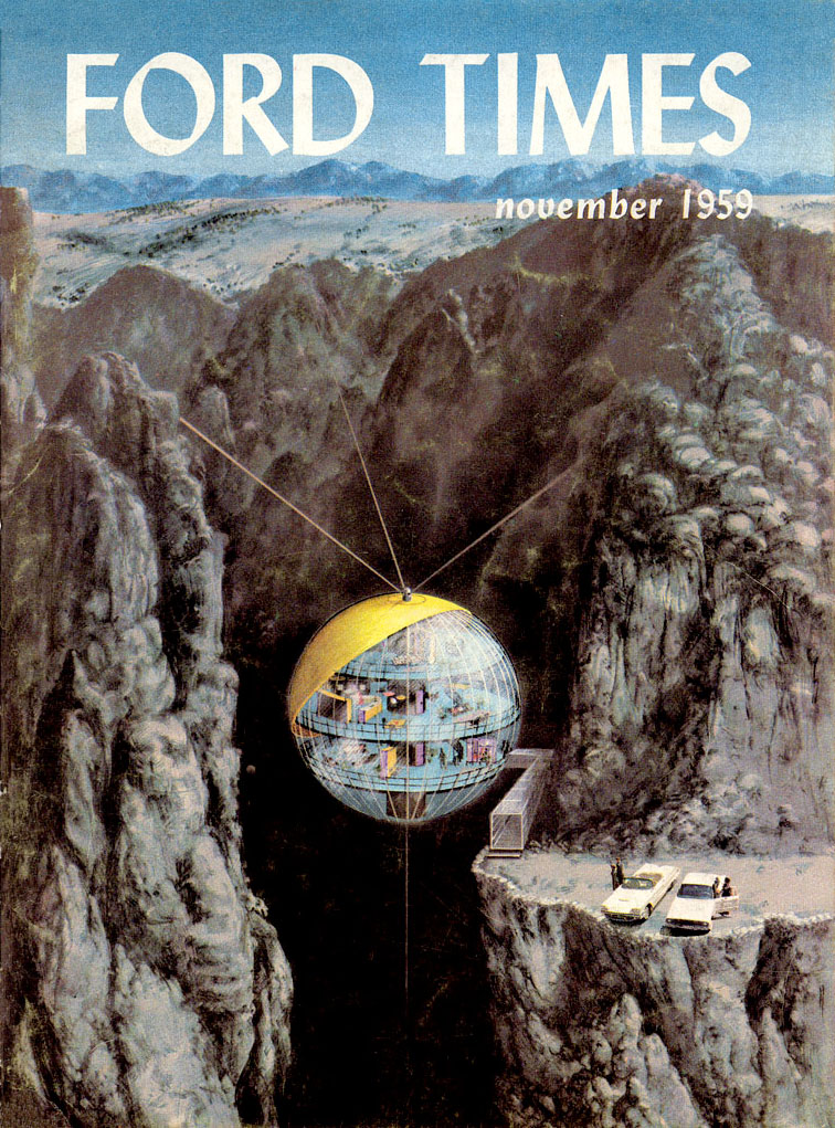
Charley and Rudy collaborated on the article “Pre-Fab Homes” for the Nov 1959 Ford Times (and, sadly, the future wasn’t nearly as awesome as they had imagined):
True Story: For almost the last 20 years I have lived literally within walking distance of the Harper studio, but it wasn’t 2009 that I visited. I can report that a.) the drive through the woods leading to the house and studio is indeed very long and narrow. b.) aside from a lot of mid-century furniture (think Eames and Nelson here), the house is filled with original artwork and books – I know I saw a Miro title in the living room. c.) The studio, which is essentially kept in state (his last unfinished painting is still on the desk) is, I am proud to say, marginally messier than my home office. Out of chaos comes order and beauty, or something like that. This wonderful photo, courtesy of Harmen Liemburg from his Sep 2006 visit, pretty well sums it up:

Unless otherwise noted all images are copyright 2013 Estate of Charley Harper and are used here by permission.
23 Jul 2009, updated 29 Jul 2015 ‧ Illustration
A Charley Harper Retrospective:
I – Charley and Edie
II – The Birds
III – Tin Lizzie/Dinner for Two
IV – The Golden Book of Biology
V – Bambi and Childcraft
VI – The Animal Kingdom
VII – Frame House