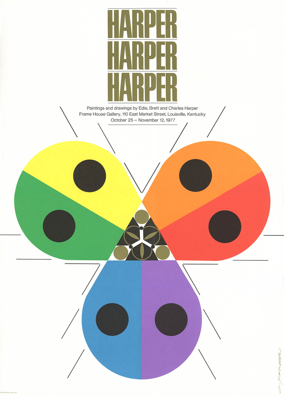
Detail, exhibition poster, 1977
137
The Sports Illustrated Book of Bridge
Jerome Snyder
Jerome Snyder (1916–2 May 1976) grew up in New York City and after graduating from Stuyvesant High School spent all of two days in art school before dropping out to begin a free-lance career as a commercial artist. After infantry service in WWII he returned to New York and was soon receiving commissions from the Container Corporation of America, Mademoiselle, House & Garden, the New York Times and, perhaps most importantly, from Leo Lionni at Fortune.
New York, for the CCA, 1948. Smithsonian
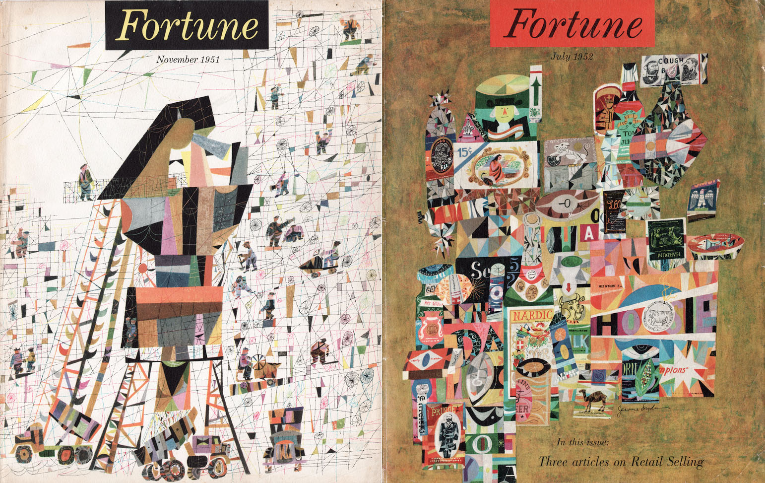
Fortune covers, 1951-52
His Fortune covers caught the attention of Henry Luce who in 1954 hired him as the art director of his new magazine – Sports Illustrated. Even within the Time/Life empire there was skepticism that a weekly magazine devoted entirely to sports would be profitable and to appease advertisers early SI issues split coverage between spectator sports such as baseball and football and more upscale pastimes including yachting, polo and bridge.
Luce, of course, had no trouble attracting respected writers and artists. For the bridge column he hired the prolific speaker, author and world champion Charles Goren.
The Sports Illustrated Book of Bridge, published in 1961, was a combination of Goren's weekly SI columns as well as quizzes, rules, history, even a 4-color section on antique playing cards. Snyder, who by this time had left SI to become the art director for Scientific American provided these beautiful illustrations for the chapter openings.
Over his 40-year career Snyder worked in many different styles - everything from simple ink line drawing to fairly realistic goauche painting - but he would be best remembered for his distinct, hyper-detailed caricature that relied on painstakingly meticulous mosaic work.
“I go back to my studio to paint. Usually a phone call is waiting from the printer: ‘Come back, something's gone wrong.’ The printers try cheerfully when I demand the impossible of the silkscreen process and their equipment and smile indulgently when I reach the limit of my patience, kick the drying racks, howl when my foot hurts, and vow to give up silkscreening forever.” 4
Jesus Bugs, 1968. Charley’s favorite painting5
Charley once said that he couldn’t draw a straight line without a ruler or a circle without a compass and over the years his work relied more heavily on both. His loose and lyrical style of the 1950s had transformd into an increasingly refined, geometrically rigorous, and almost clinically precise graphic style by the end of the 1960s – the final evolution of “minimal realism.”

Unzipped, 1970
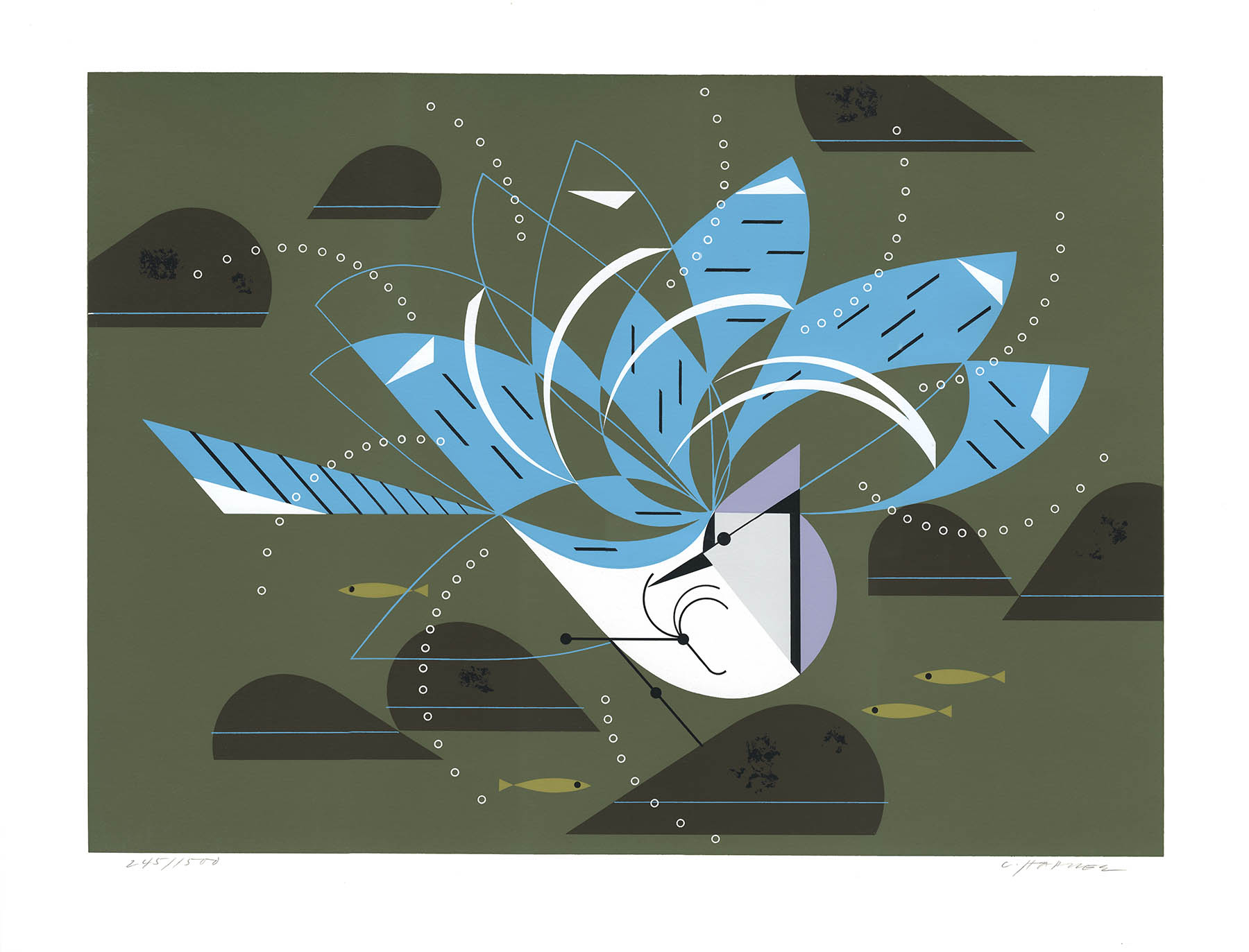
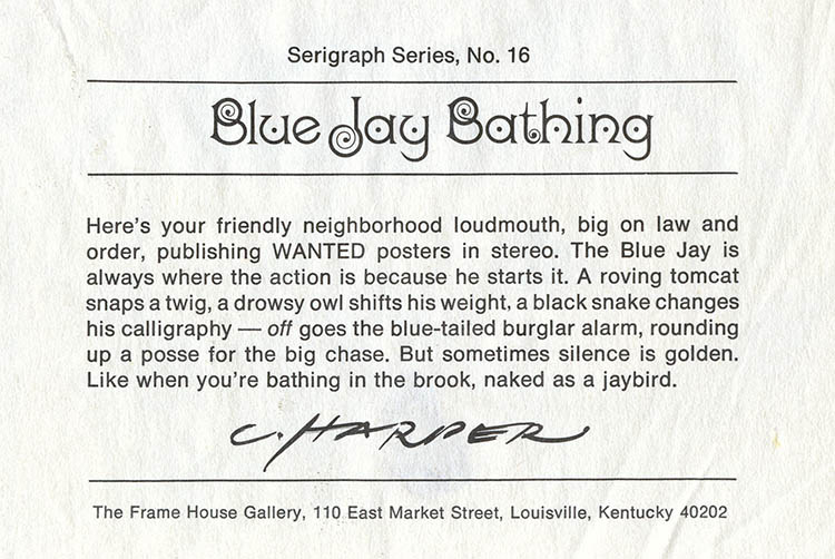
Blue Jay Bathing, 1971 6
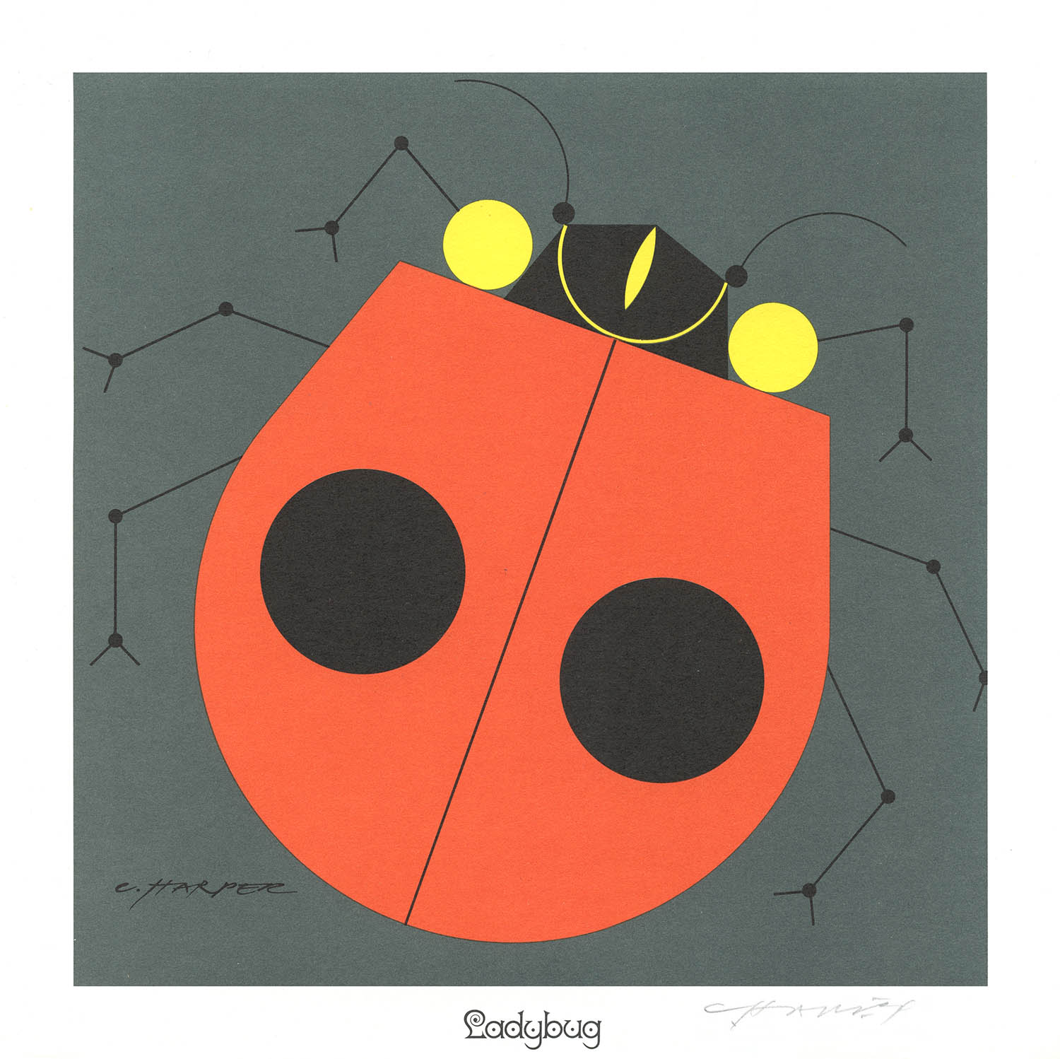
Ladybug, 1974
In addition to his frustrations with silkscreening, Charley also had a difficult time with the entire business of art publishing. As he said in 1981:
“Frame House is the only gallery I’ve ever dealt with that is run like a business. with business people in charge and lots of promotion and PR. I had a difficult time adjusting to that at first but it really turned out well in the long run.” 3
It turned out pretty well indeed. In all he produced more than 100 serigraphs for Frame House.
Fearless Feathers, 1987
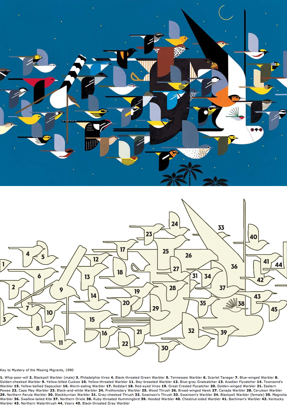
Mystery of the Missing Migrants, 1990

Clair de Loon, 1992
By the 1970s Charley considered himself foremost a wildlife artist and became a committed conservationist and environmentalist long before it was fashionable. Eventually he was accepting commissions only from organizations that shared his views. He did work (mostly posters) for organizations such as the Audobon Society, the Cape May Bird Observatory, the Cincinnati Nature Center, the Hamilton County Park District, the US National Park Service and the Cincinnati, Louisville and San Diego Zoos. This list goes on but you get the idea.
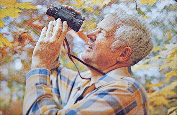
Charley as a naturalist, 1974
His posters represent some of the most compositionally complex work of his long career; they were the final application of “minimal realism.” Here, as an early example, is his wonderful four seasons series for the Cincinnati Nature Center:
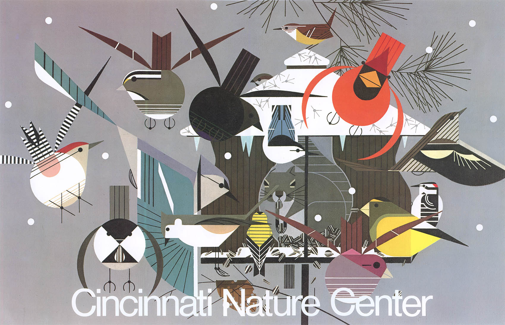


Cincinnati Nature Center, 1979
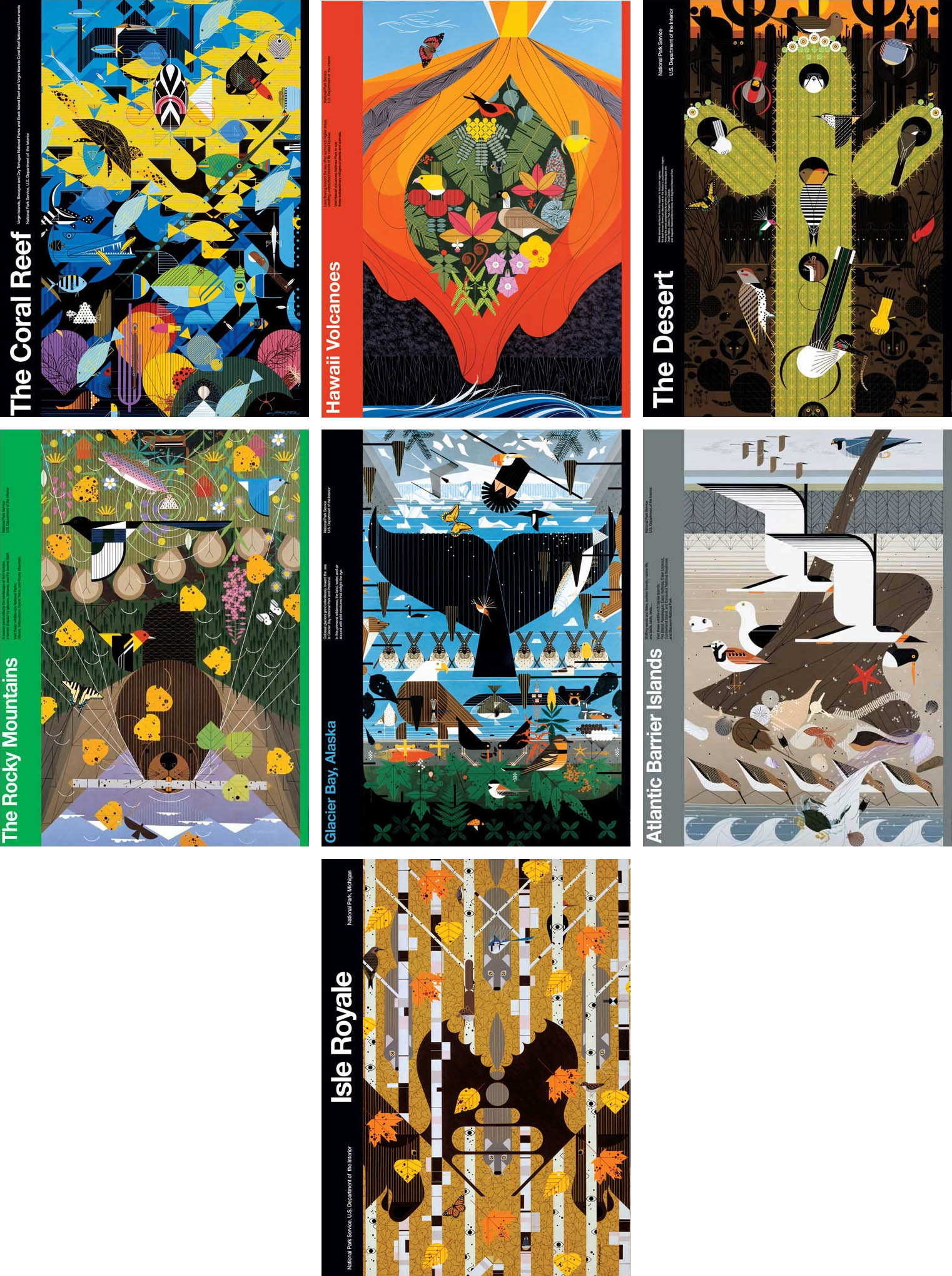
Perhaps the high point of his poster work was a series of ten commissions for the National Park Service in the late 1980s–early 1990s:
Charley gave up his teaching position at the Art Academy in 1979. He illustrated has last Ford Times cover in 1982 and as the years rolled by he and Edie began to slowly scale back their studio. But then there was, as Michael Beruit wrote, a “curious coda” at the end of his career.7 In 2003 Todd Oldham, the MTV House of Style designer and life-long fan, struck up an unlikely friendship with Charley, who was 43 years his senior. Oldham spent five years carefully archiving Charley’s vast output and published the gargantuan Charlie Harper, An Ilustrated life. After 60 years of work, where he was known only in Southwest Ohio and among conservation and birding circles, Charley became an overnight star. This new found attention left the West Virginia farm boy both bewildered and bemused.
Charley died of pneumonia on 10 Jun 2007, only days after he reviewed Oldham’s galleys for the book. Edie died of Alzheimers complications on 23 Jan 2010. Brett, their only son, continues to manage the studio and estate.
There’s plenty more about Charley and Edie – their life, art and legacy – that could be said, but for now we’ll leave things here .
Frame House folder
A Charley Harper Retrospective
- Part I – Charley and Edie
- Part II – The Birds
- Part III – Tin Lizzie and Dinner for Two
- Part IV – The Golden Book of Biology
- Part V – Bambi and Childcraft
- Part VI – The Animal Kingdom
- Part VII – Frame House
1. In 1962 the Kentucky wildlife artist Ray Harm and the Louisville businessman/art collector Wood Hannah, Sr. founded Ray Harm Wildlife Associates with the intention of selling limited-edition prints of Ray’s work – a revolutionary idea in art marketing. The name was soon changed to Frame House Gallery Publishing Inc. and they expanded their roster of artists to include not only Harm and the Harpers but other (mostly wildlife) artists including Guy Coheleach, Charles Frace, Jim Harrison and the Harper protoge Ikki Matsumoto.
Hannah’s business-like approach revolutionized how art was marketed. No longer was it a case of selling paintings one at a time out of the trunk of your car, but rather 500 or 1500 prints at a time. Although this model brought the works of Harm or Harper into the living room, it also brought us the work of Thomas Kinkade, Painter of Light® – so Cave quid optes.
After Frame house closed its doors ca.1991, Charley’s serigraphs were published by Somerset House Publishing and later by Mill Pond Press.
2. Quoted from Charley’s letter to Wood Hannah.
3. From Findsen, Owen. “A Different Kind of Bird.” Cincinnati Enquirer, 23 Aug 1981.
4. From Charley’s Frame House Galleries interview, 1974.
5. The original acrylic painting hung in his bedroom for years. It reminded him of watching water striders in the creek on his childhood farm in West Virginia.
6. Charley wrote a short essay to accompany each of his prints. These essays have been described as anything from “poetry” (John Ruthven) to “wince-inducing puns” (Michael Bierut). Here is the essay for Blue Jay Bathing:
7. Beruit, Michael. Flat, Simple and Funny: The World of Charley Harper. Design Observer.
11 Feb 2013 ‧ Illustration